ENVIRONMENTAL BRANDING
For five years, I worked on creating engaging spaces, using brand elements to immerse people into their offices. From turning plain walls into exciting storytelling areas to blending brand messages seamlessly into designed spaces, every detail matters. The core of environmental branding is about sharing a story. It’s about designing spaces that mirror your brand's values, character, and dreams. It encourages others to enter your brand’s world and encounter that story, that experience, firsthand.
By placing brand elements strategically in the physical world, we can stir feelings, shape viewpoints, and connect with people. It crafts a complete experience that involves all senses for a memorable impact, providing brands a chance to be unique. These are some, not all, of my favorite environmental branding projects!
Fun Fact
Most of the project photos were taken by me. I was very fortunate to get support to do so while at PBD/Spark. I was the primary photographer for all projects completed while I worked there.
Aspen Dental, a couple of the GCFD, as well as the Paylocity Lake Mary were not photographed by me.

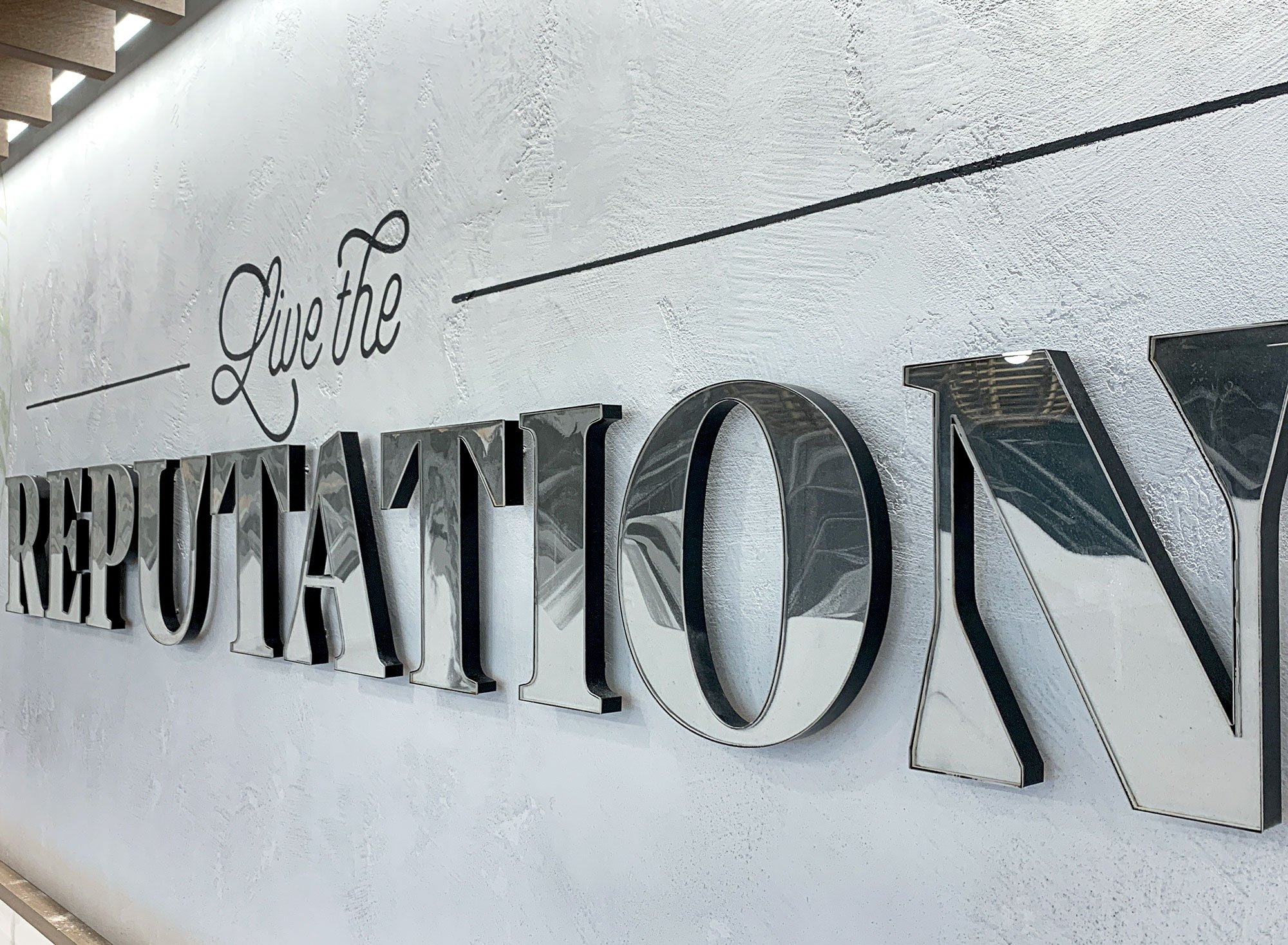
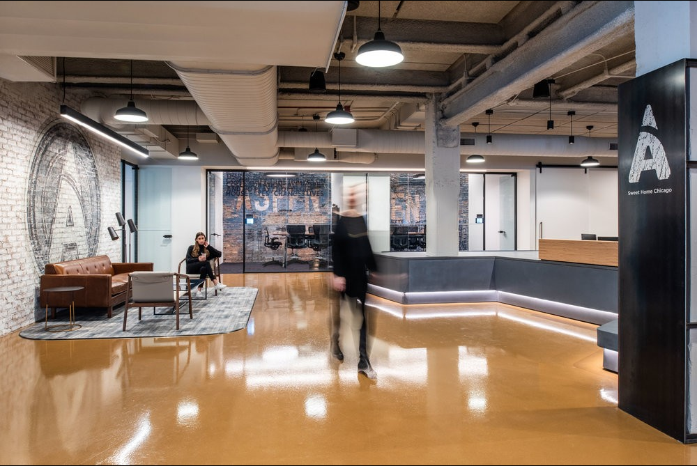
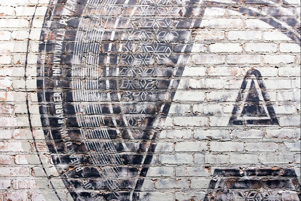
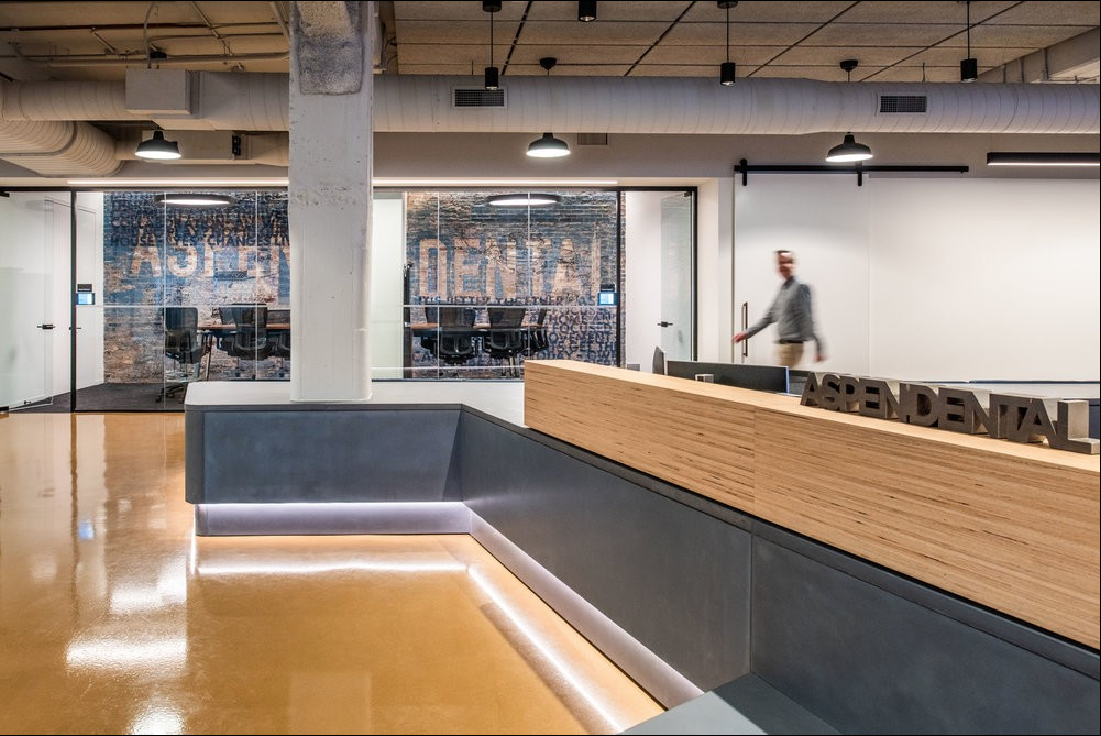
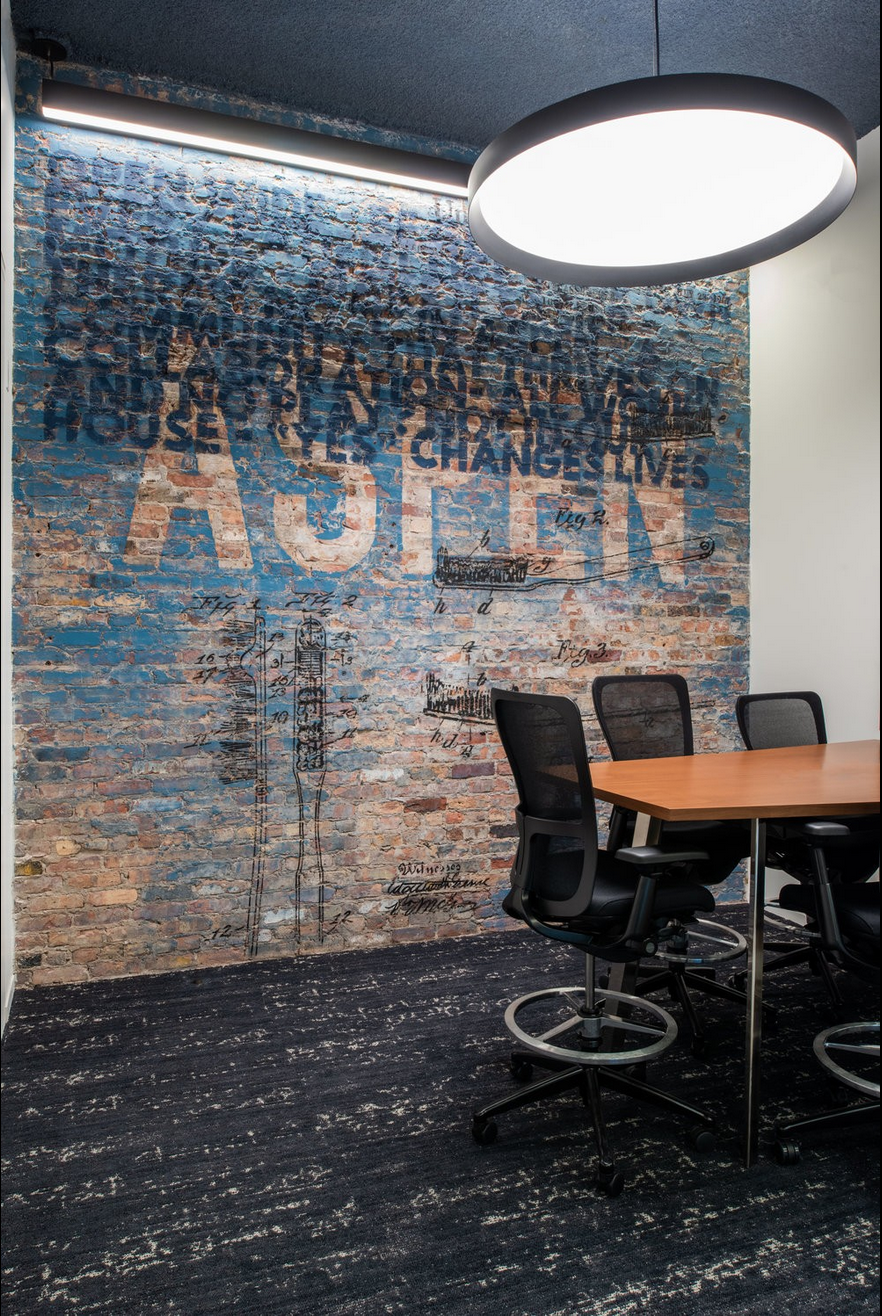
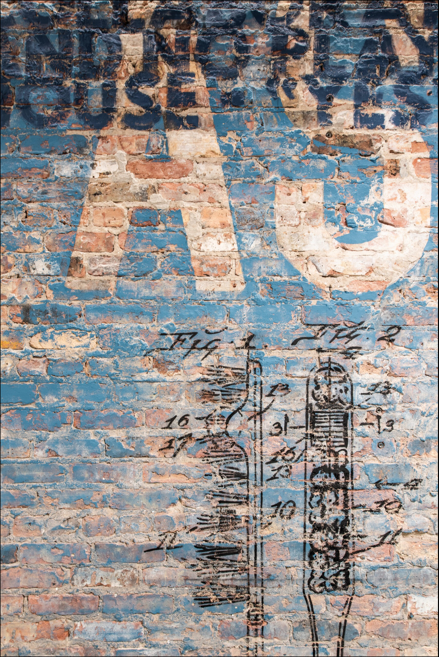
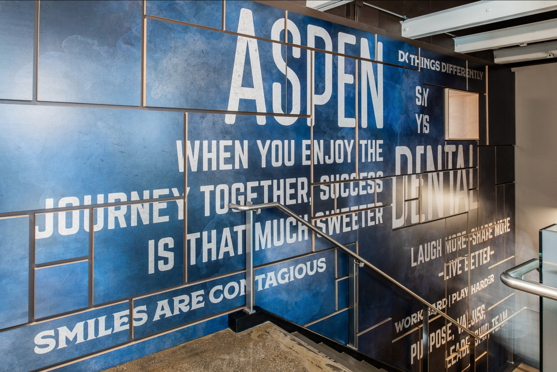
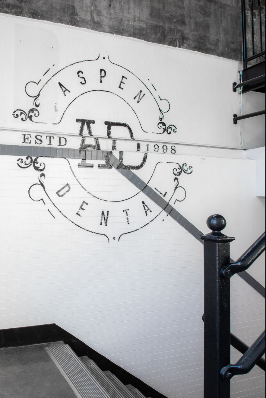
Aspen Dental opened a Support Services off ice in Fulton Market. Through use of materials and graphic applications, we were able to embrace the neighborhood’s atmosphere while showcasing the culture, mission, and values of Aspen Dental as a whole. This project was completed while I was at Forcade Associates in collaboration project with Perkins + Will and one of my favorites to work on. Every graphic was completely custom.


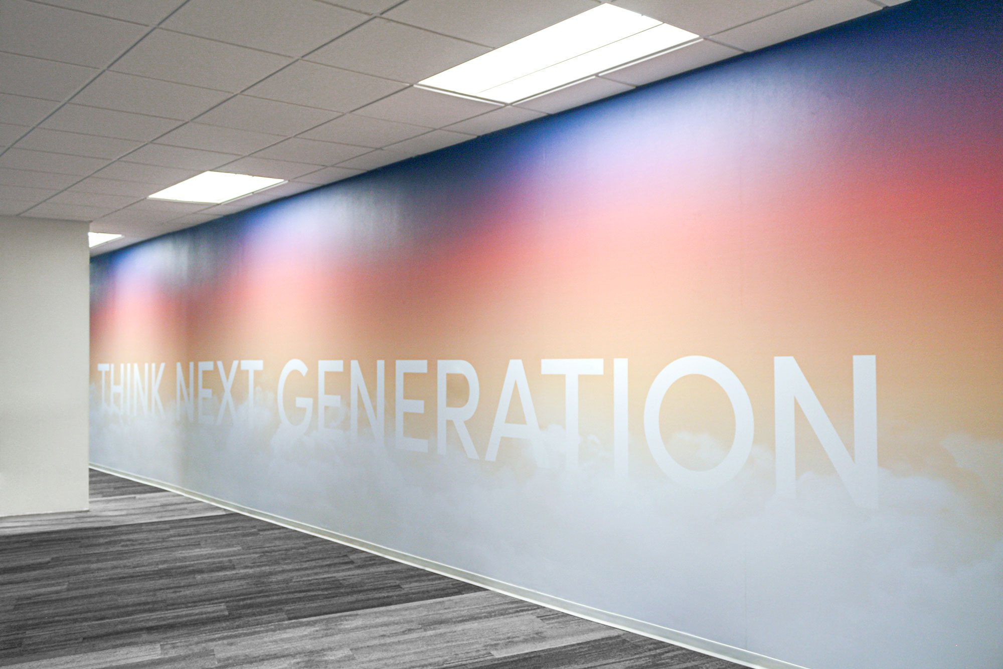
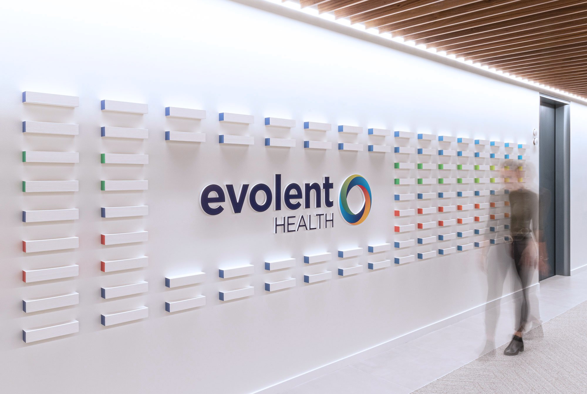
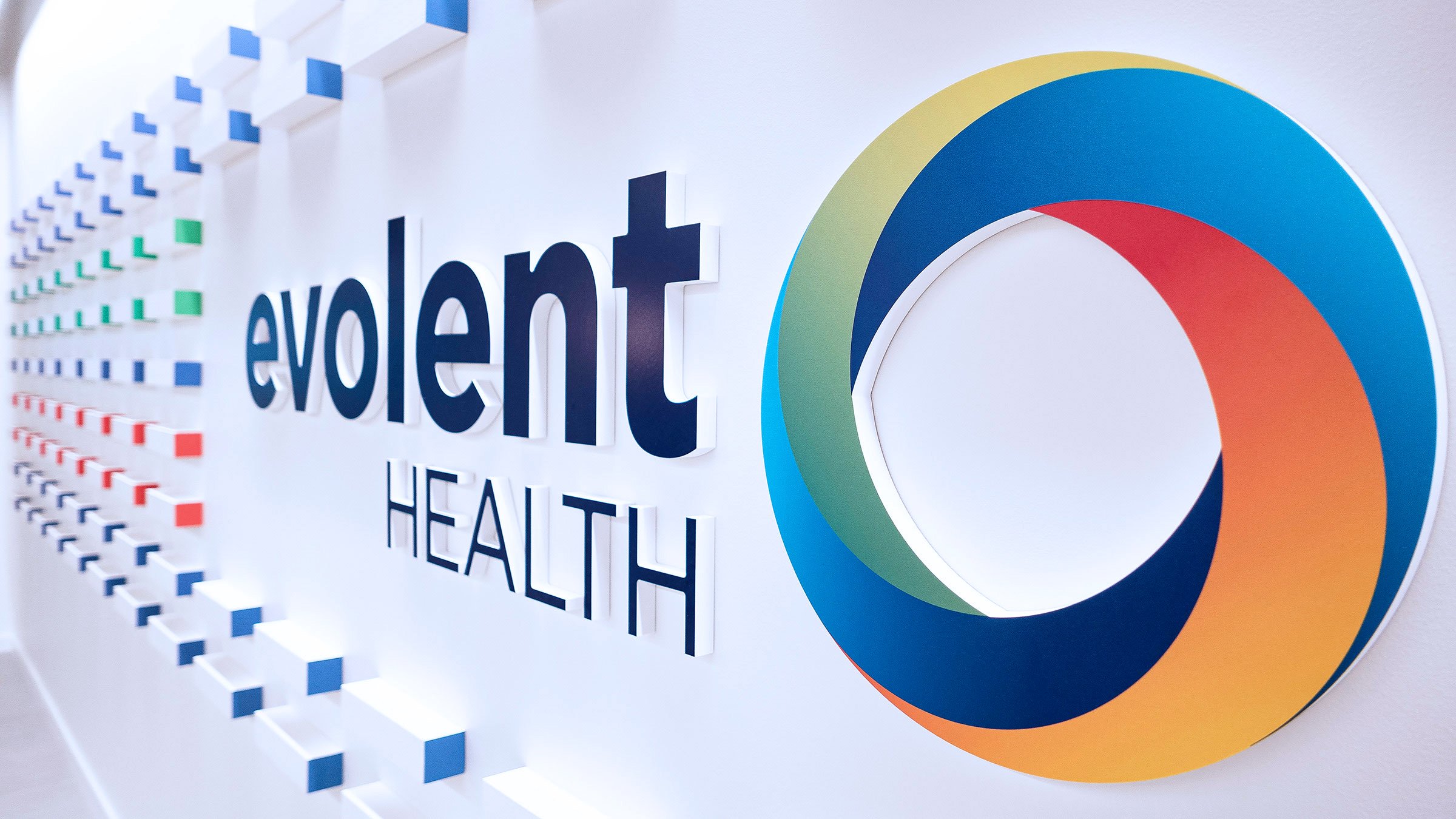
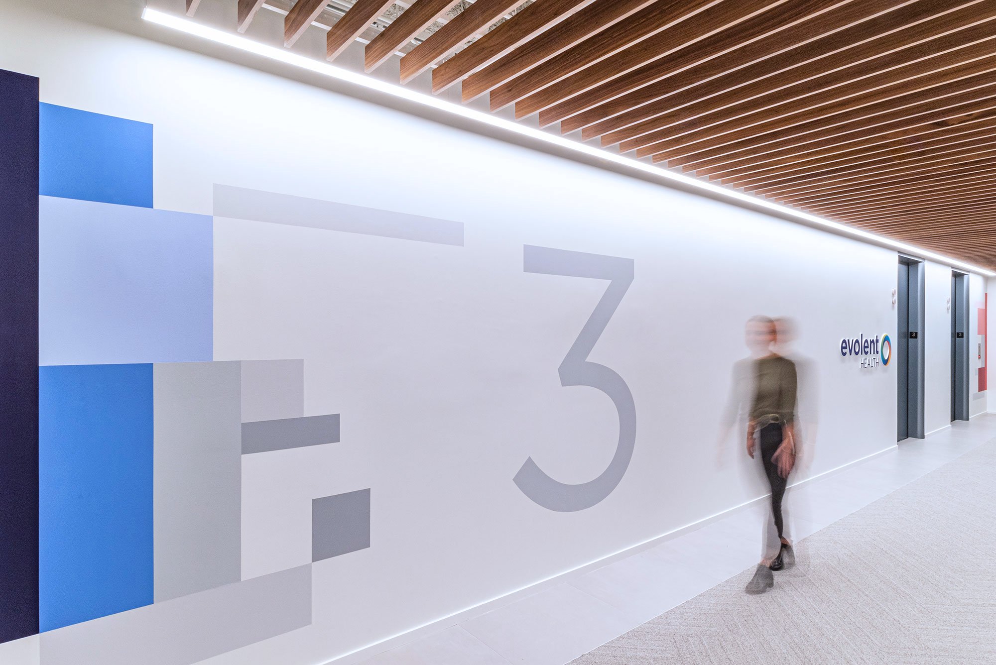
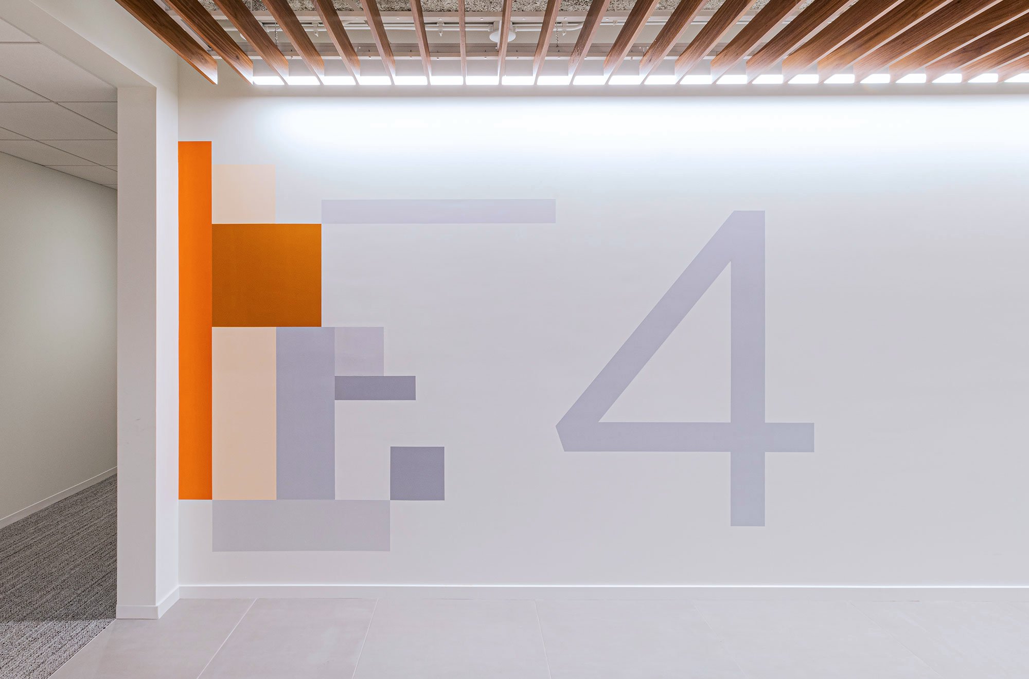
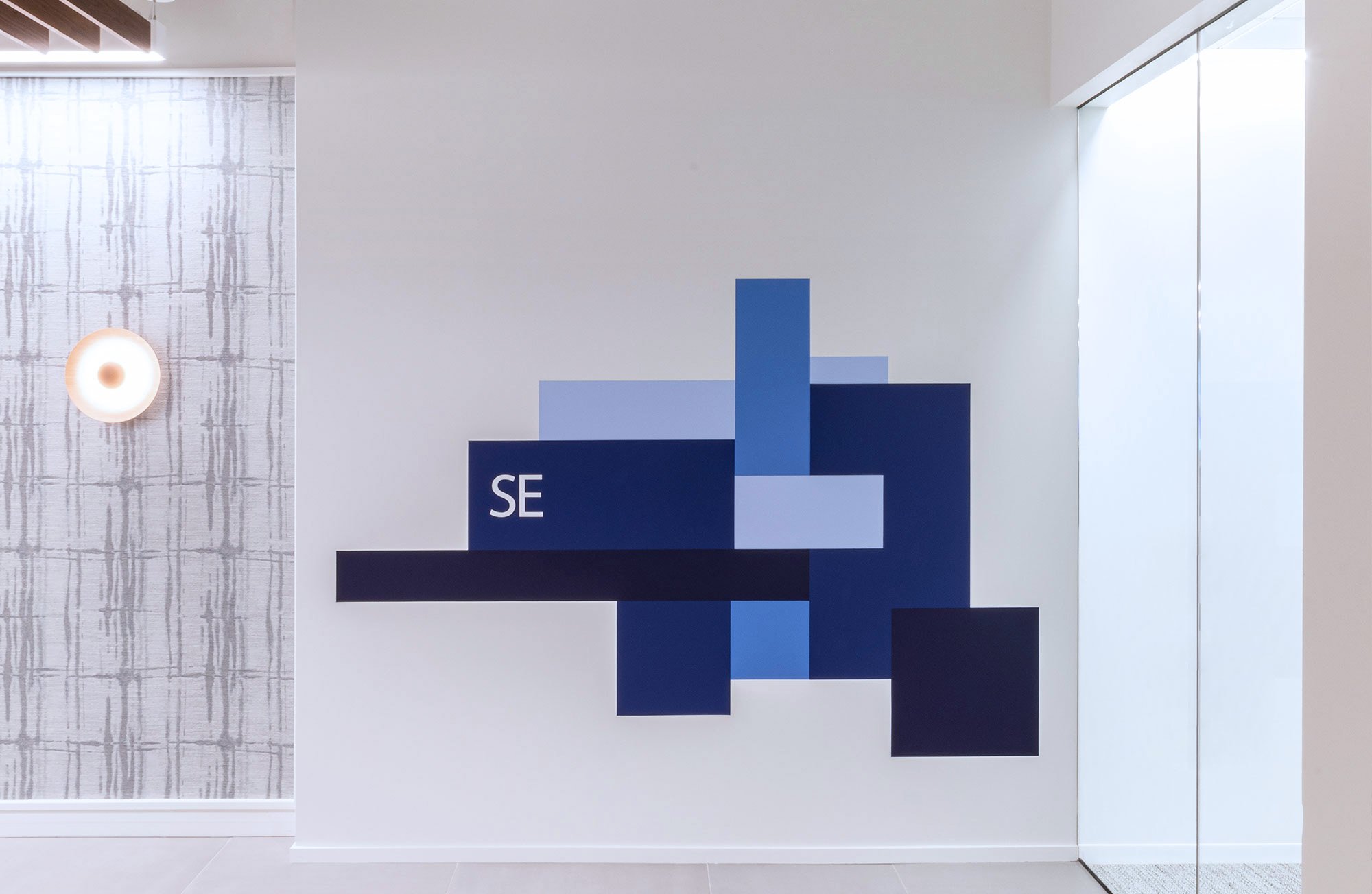
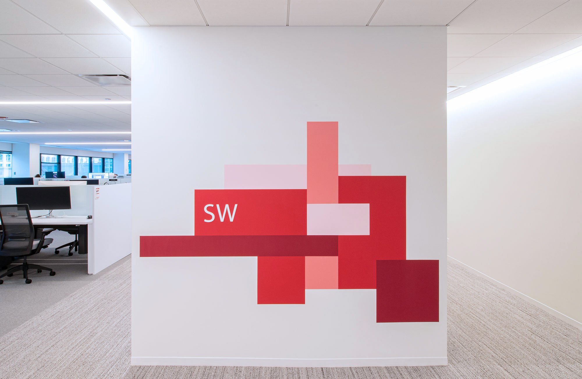
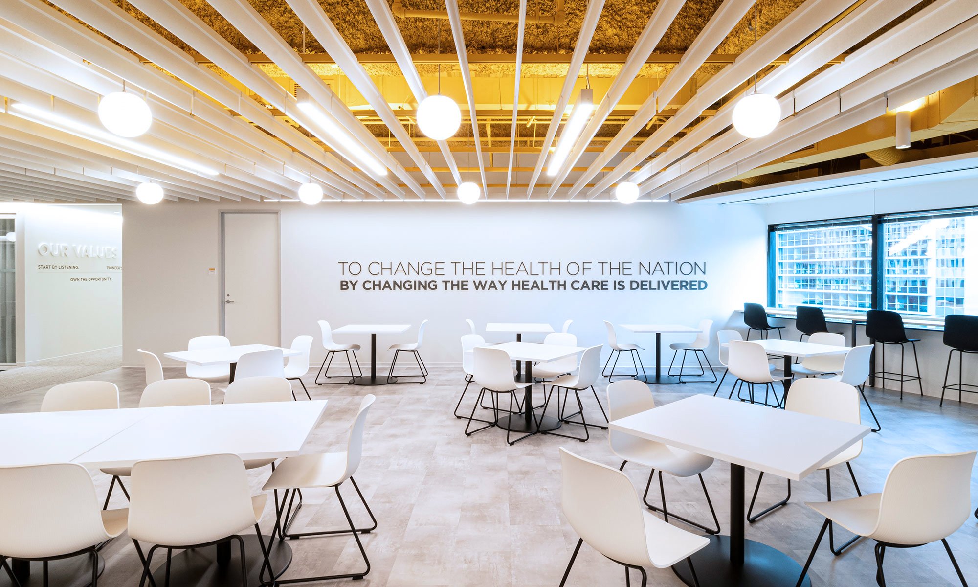
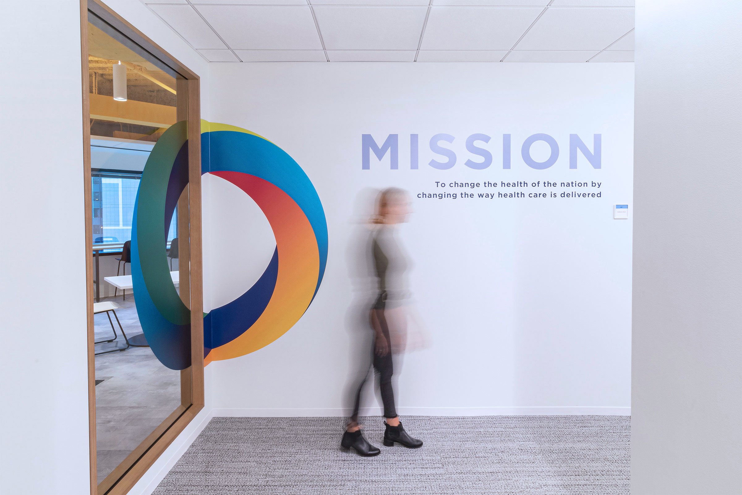
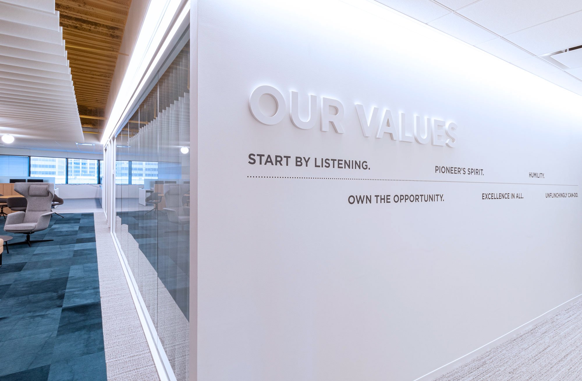
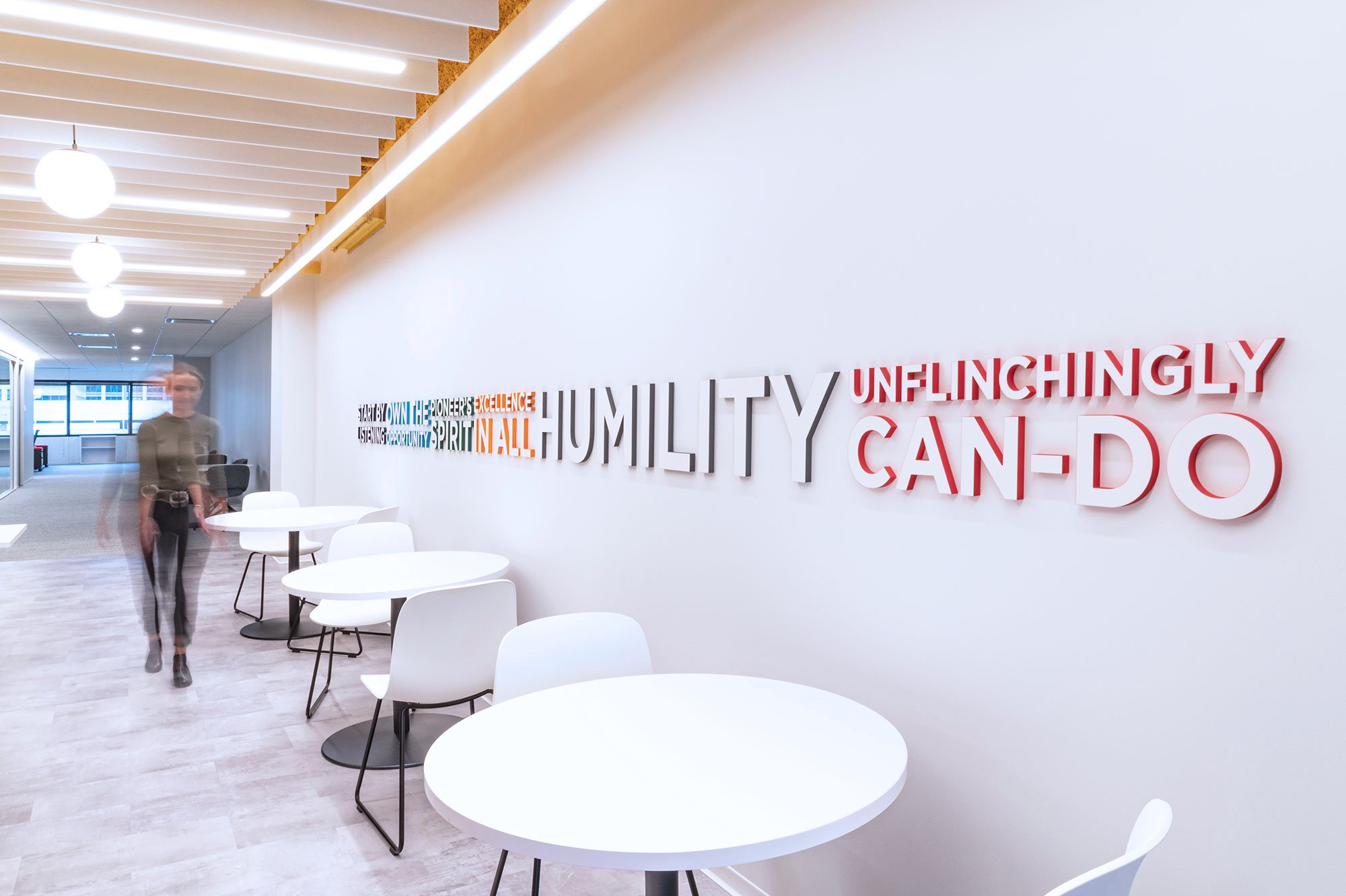
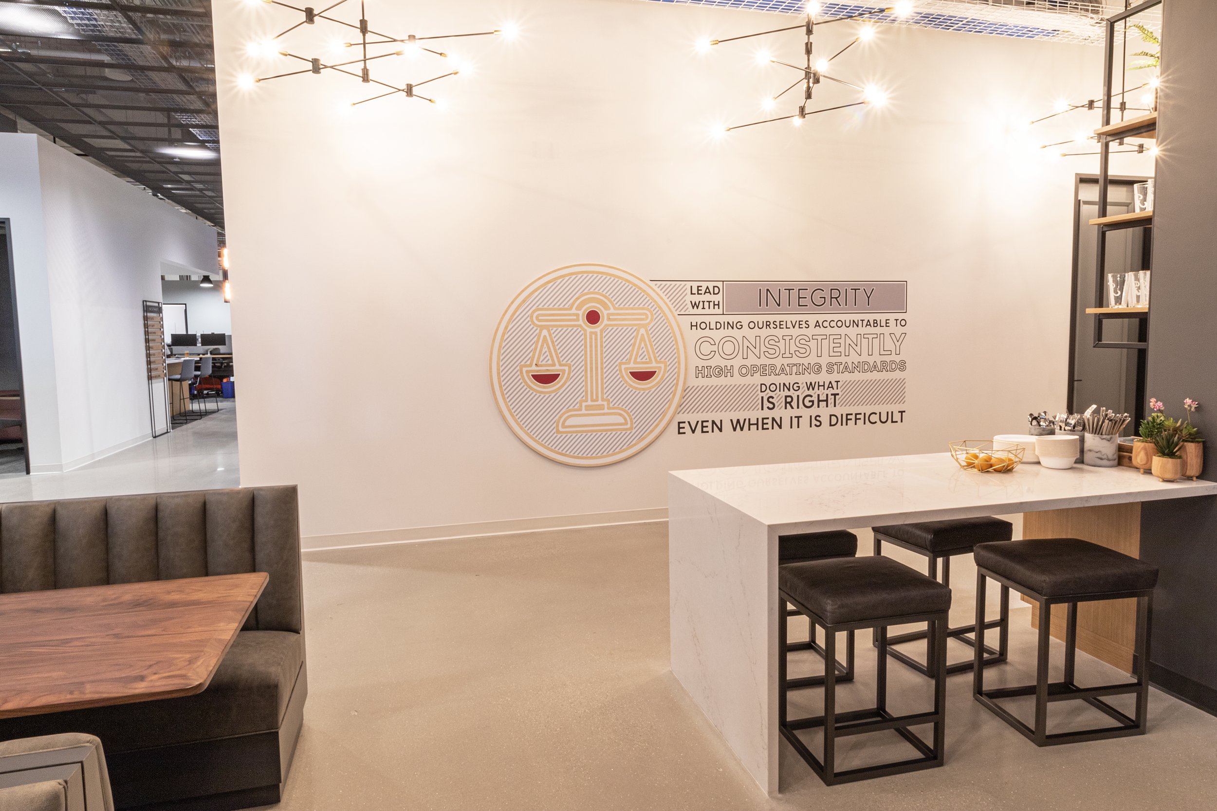
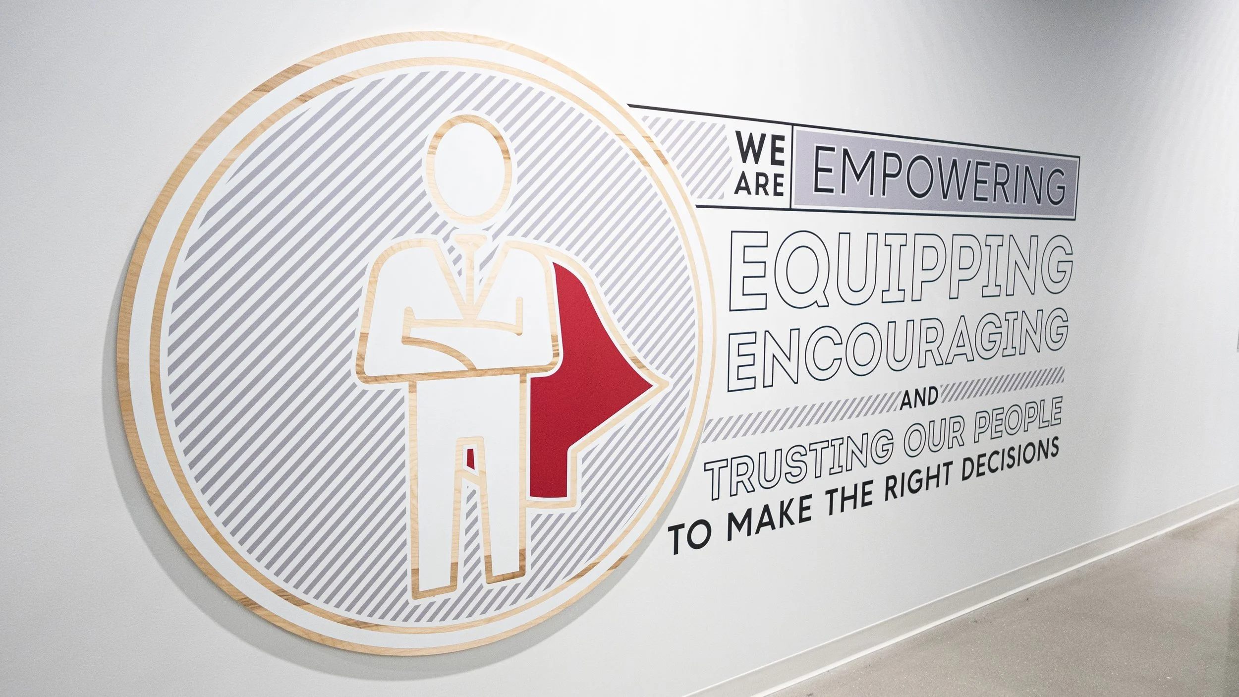
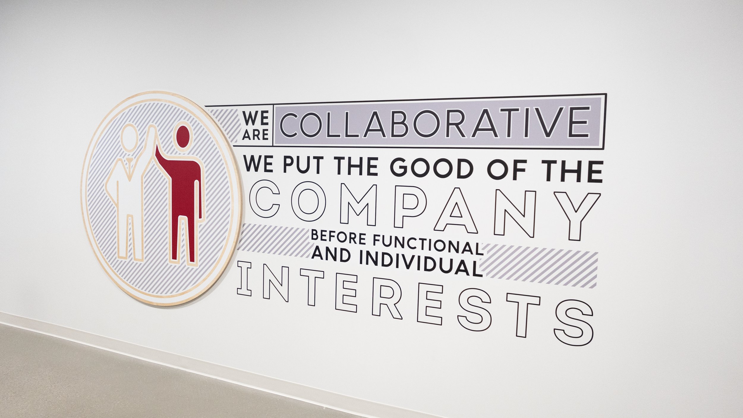
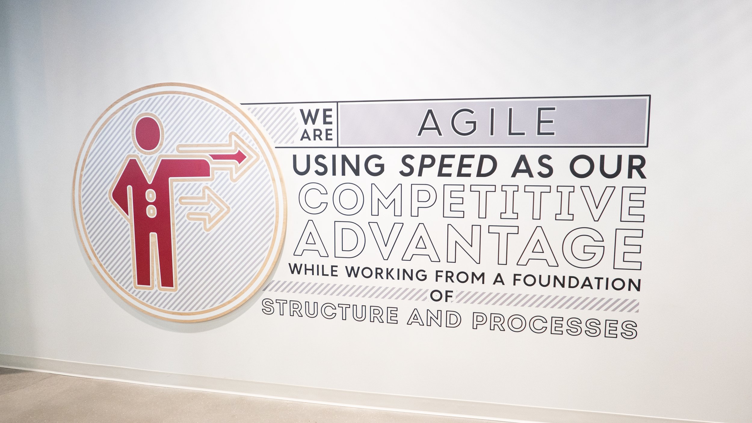
Evolent Health, a health care company that delivers clinical and administrative solutions to payers and providers, wanted to establish their brand within the white walls of the newly designed office.
Working with leadership, we developed bold, sophisticated branding elements that expressed company culture and values. The goal was to create a strategic wayfinding system that unified but distinguished all occupied floors. The branding needed to be a cost effective solutions that would generate large impact to employees.
This project was completed during my employment at Partners by Design/Spark.


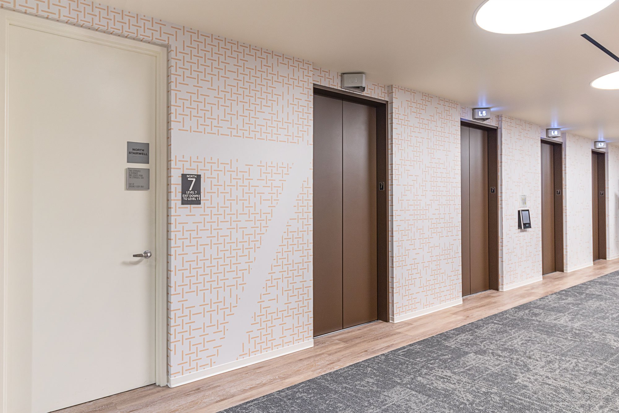
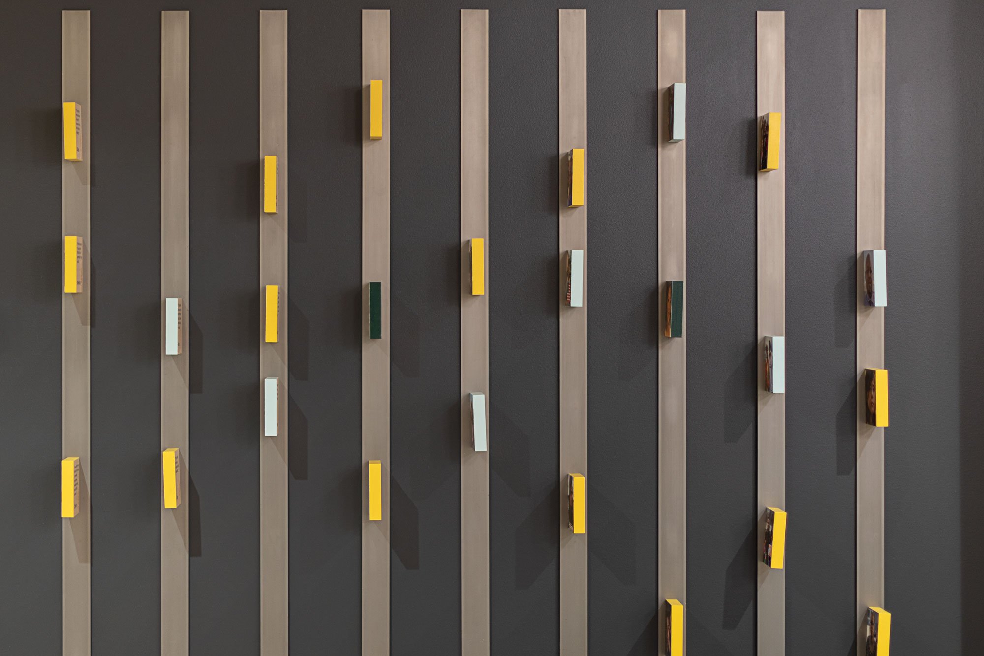
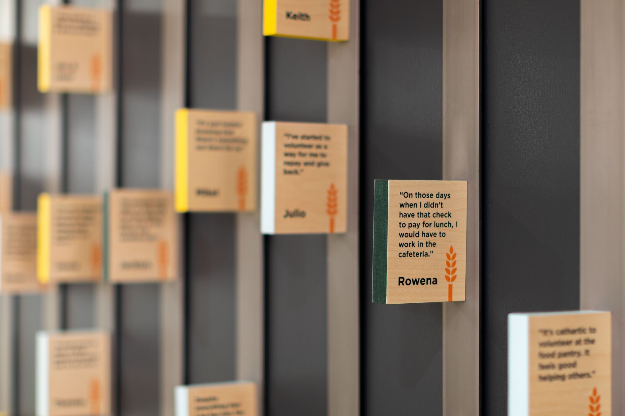
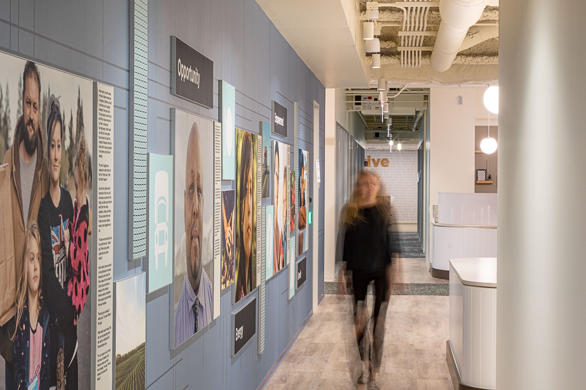
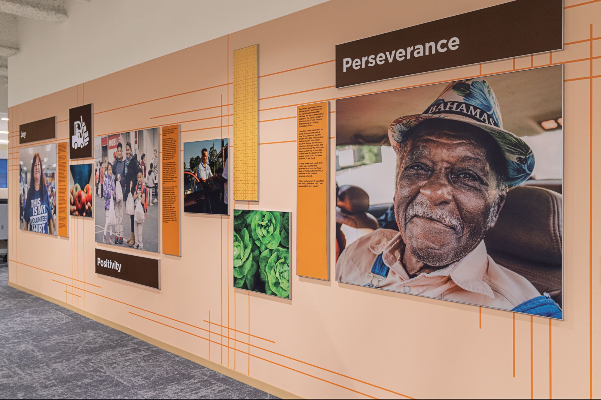
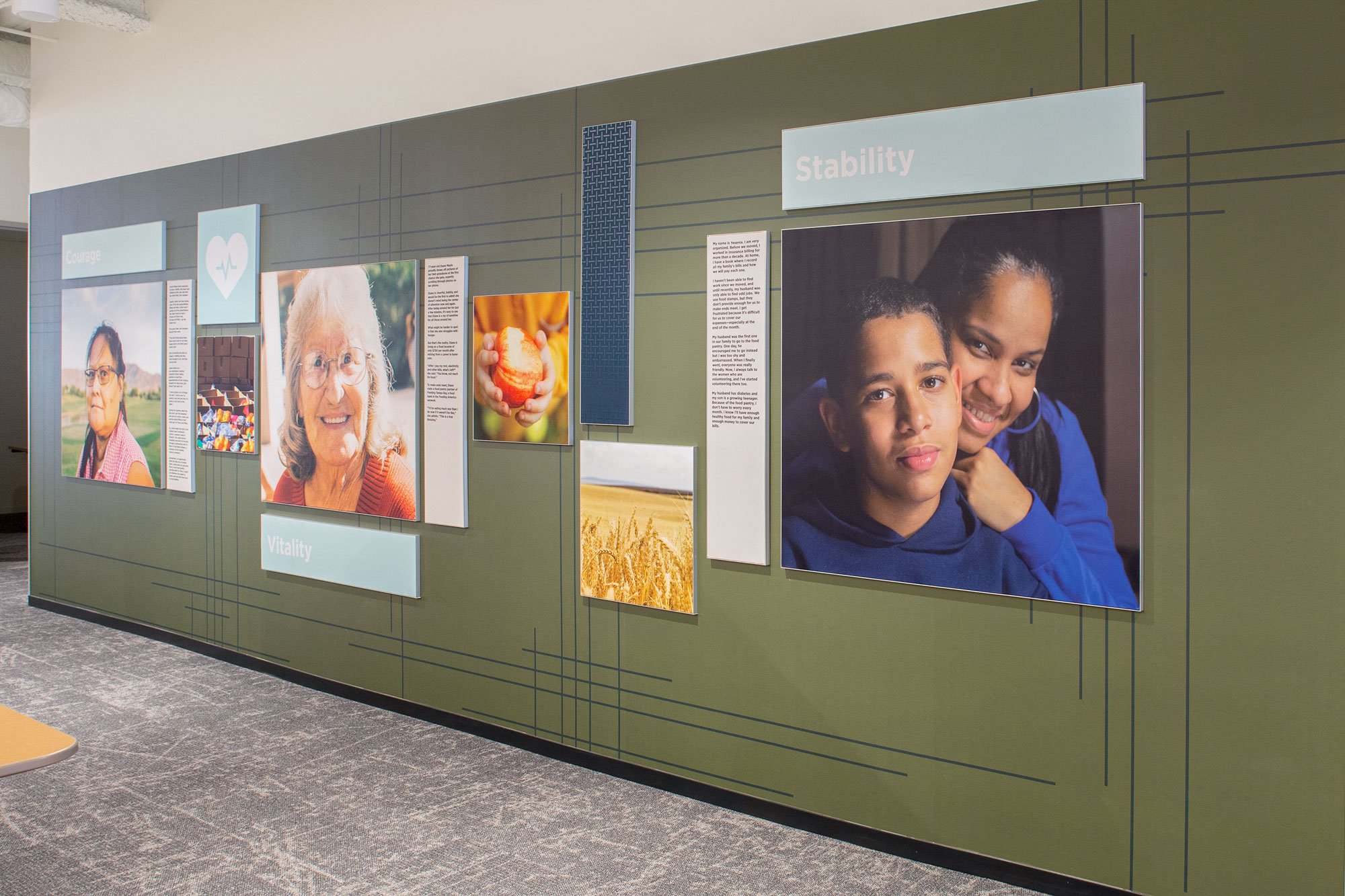
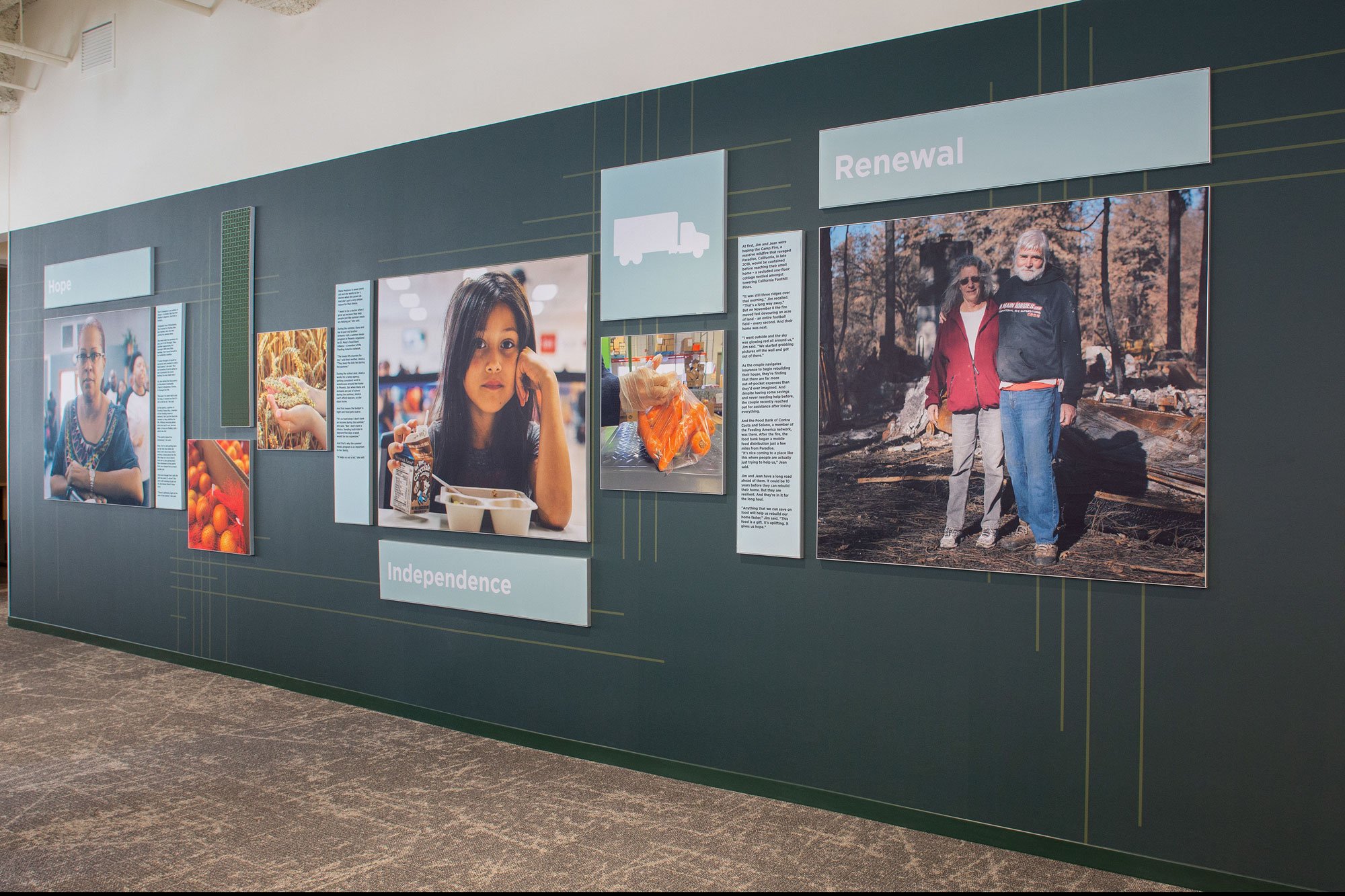
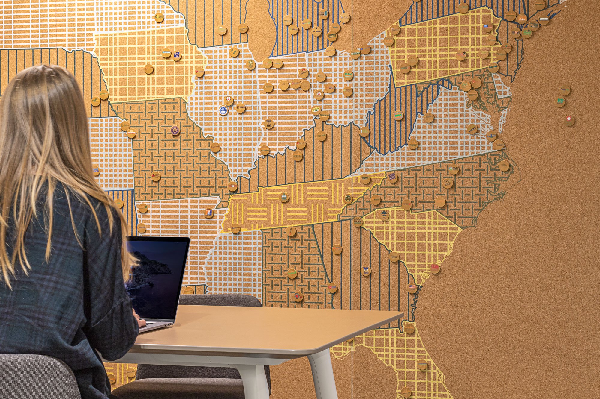
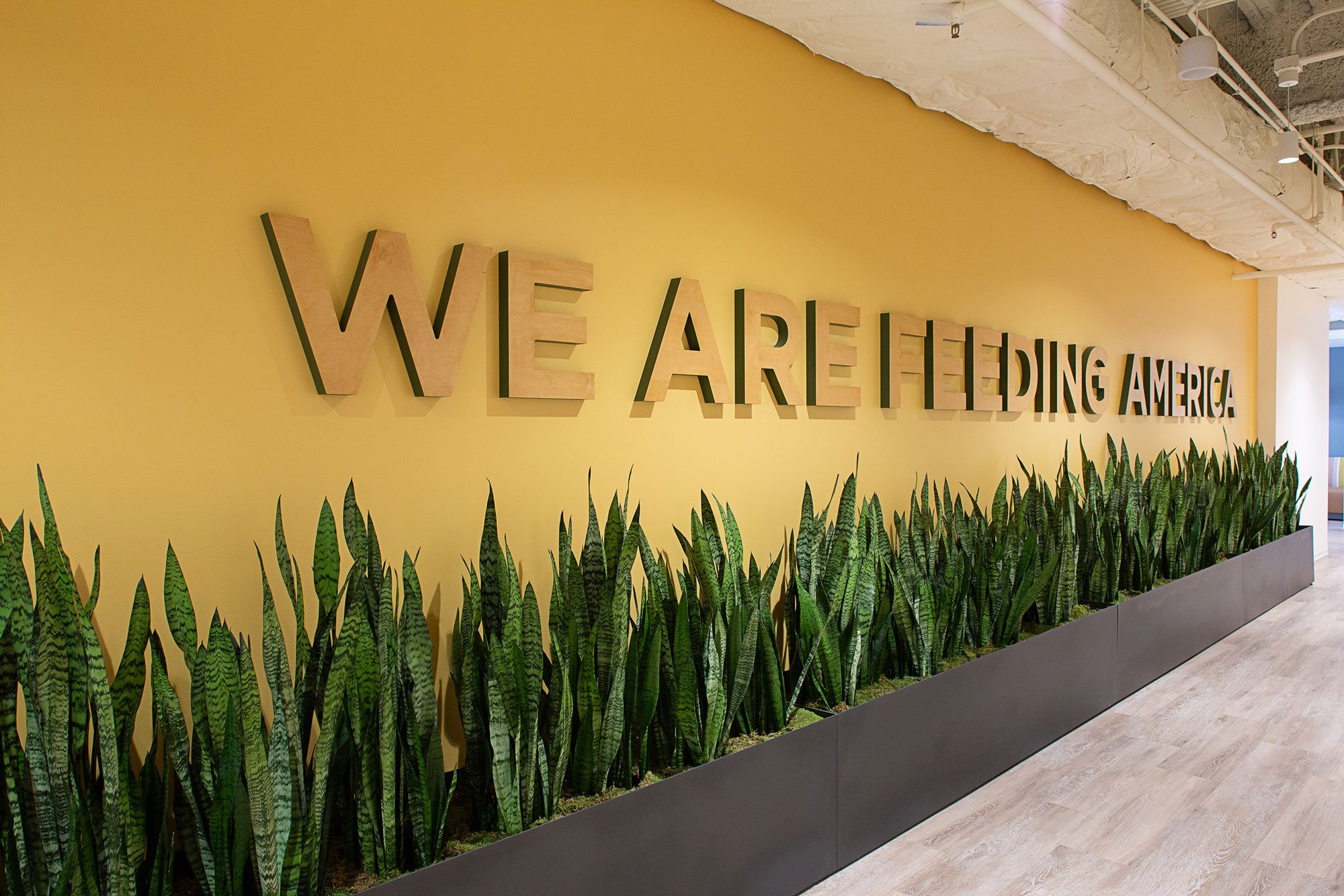
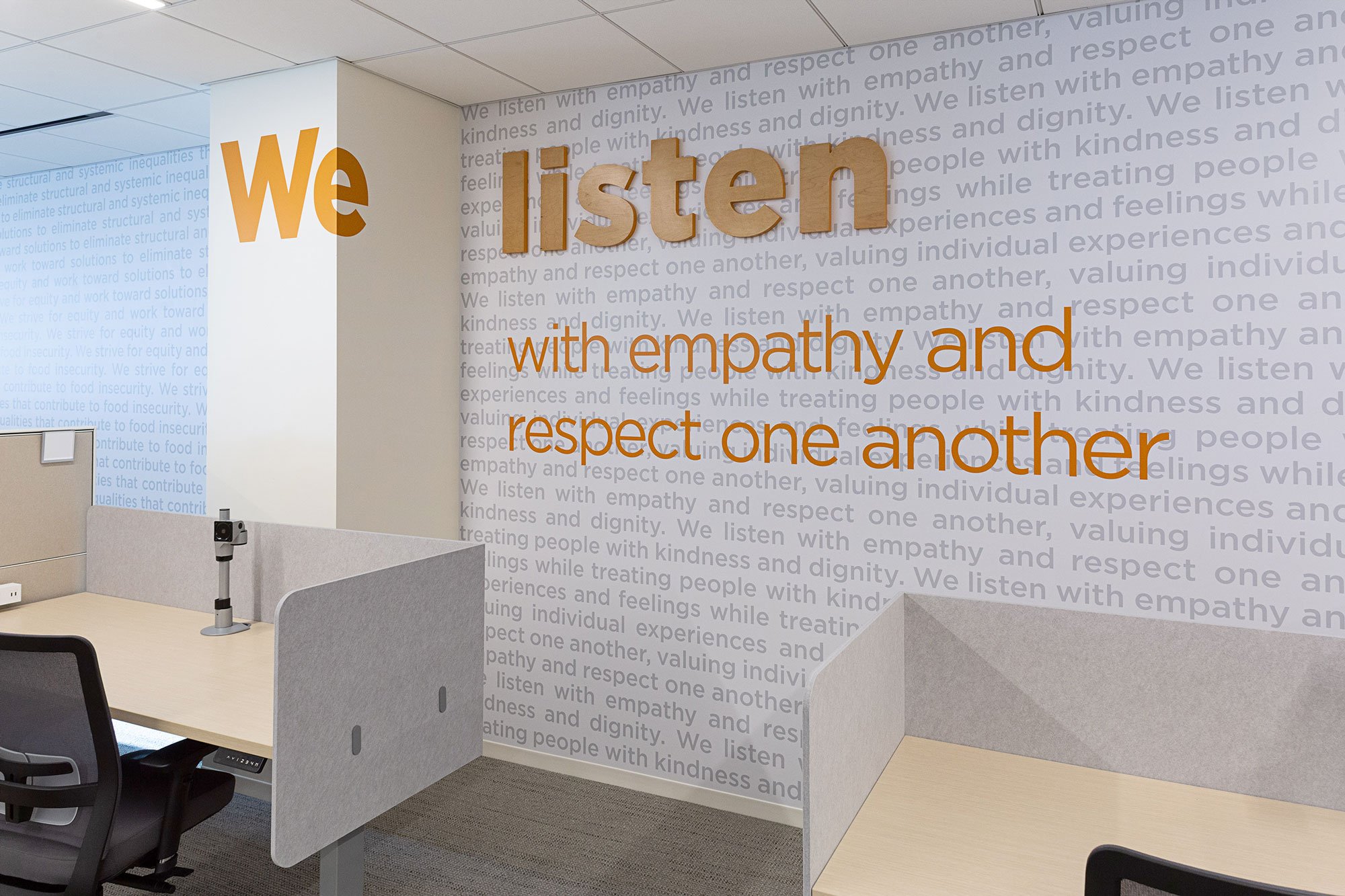
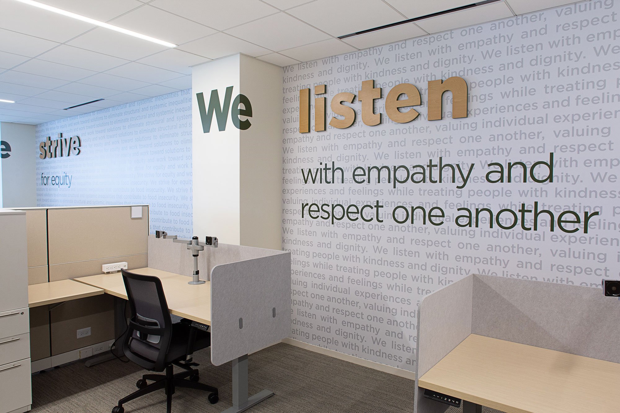
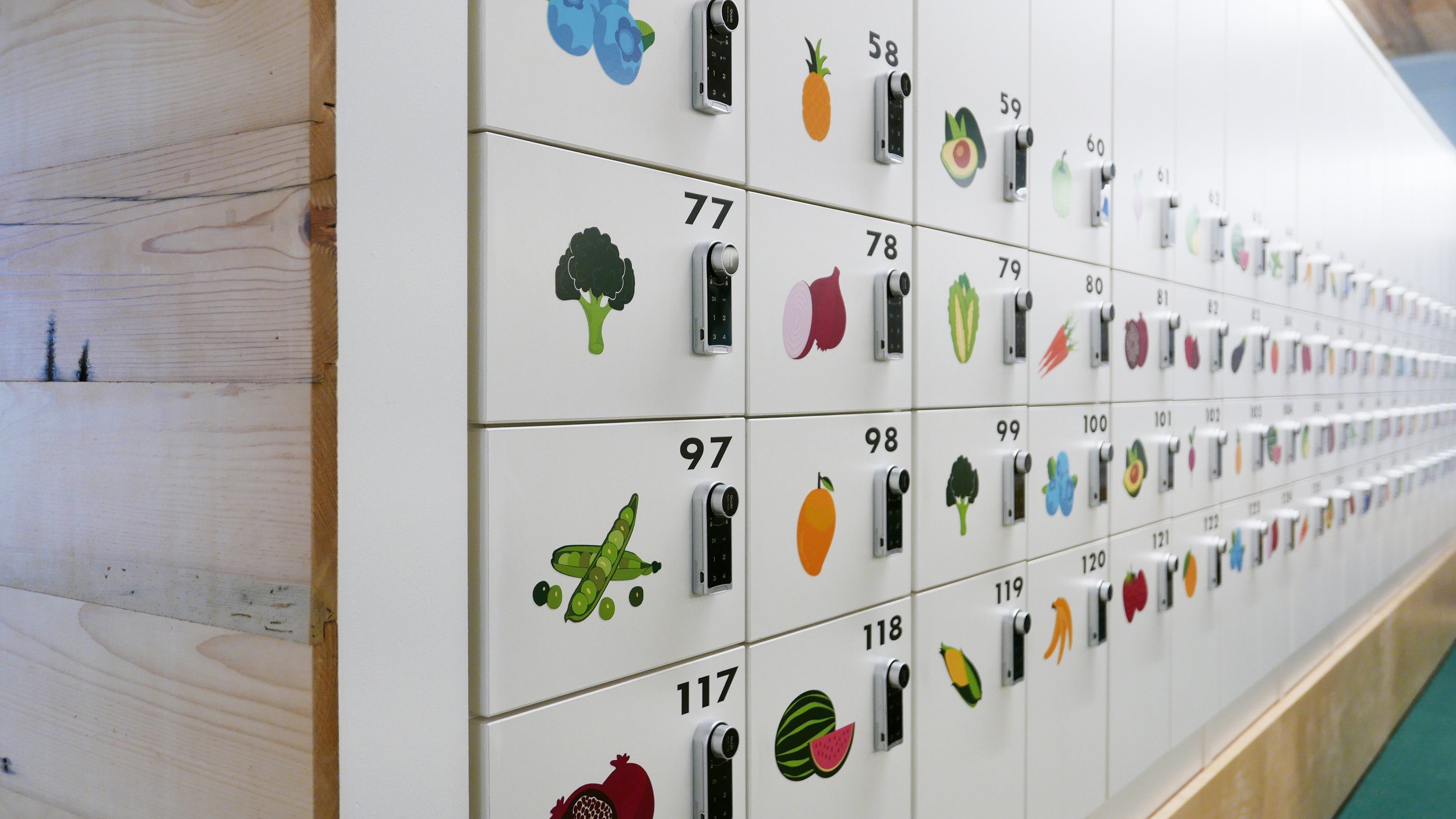
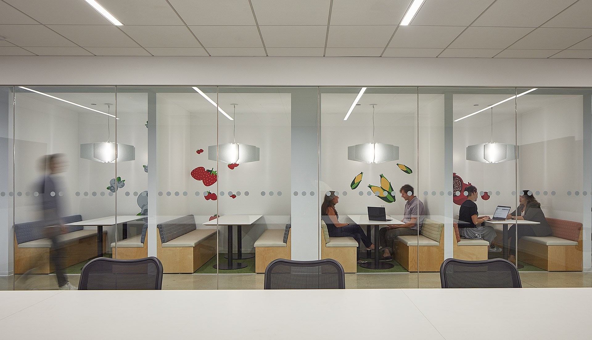
Feeding America offers help to those in need through a nationwide network of food banks. Their mission is simple: to feed America’s hungry and engage the country in the fight to end hunger.
By utilizing their branding patterns, extensive color palette, and beautiful photography, we were able to share the impactful stories of the people they serve and help every single day. Between the two floors, we developed a system of wayfinding based on the two colors of the logo. One floor reflects the orange color and the other reflects the green. Together, all branding elements help paint the picture of Feeding America’s mission.
This project was completed during my employment at Partners by Design/Spark.


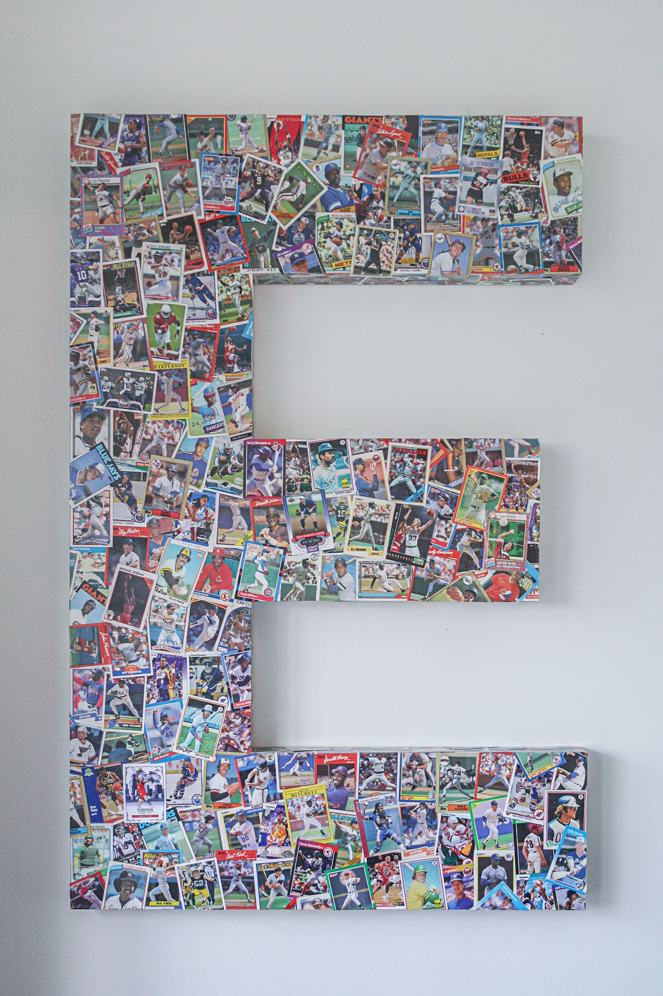
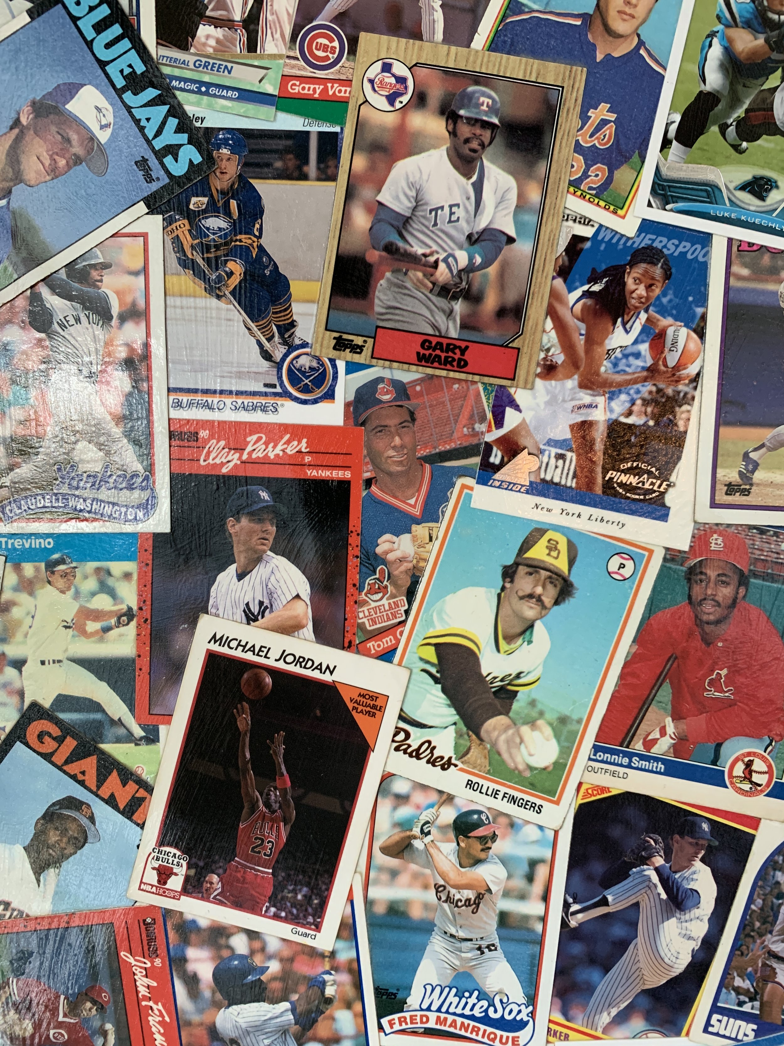
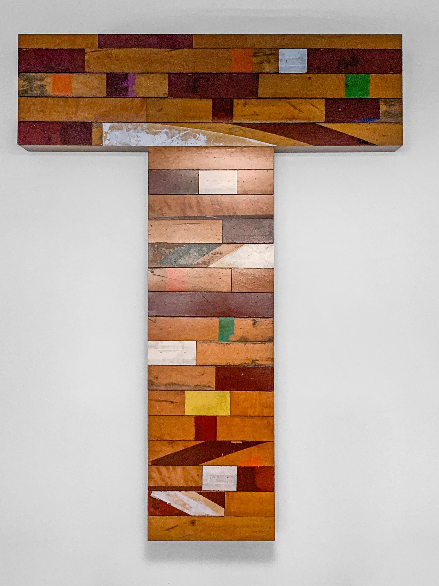
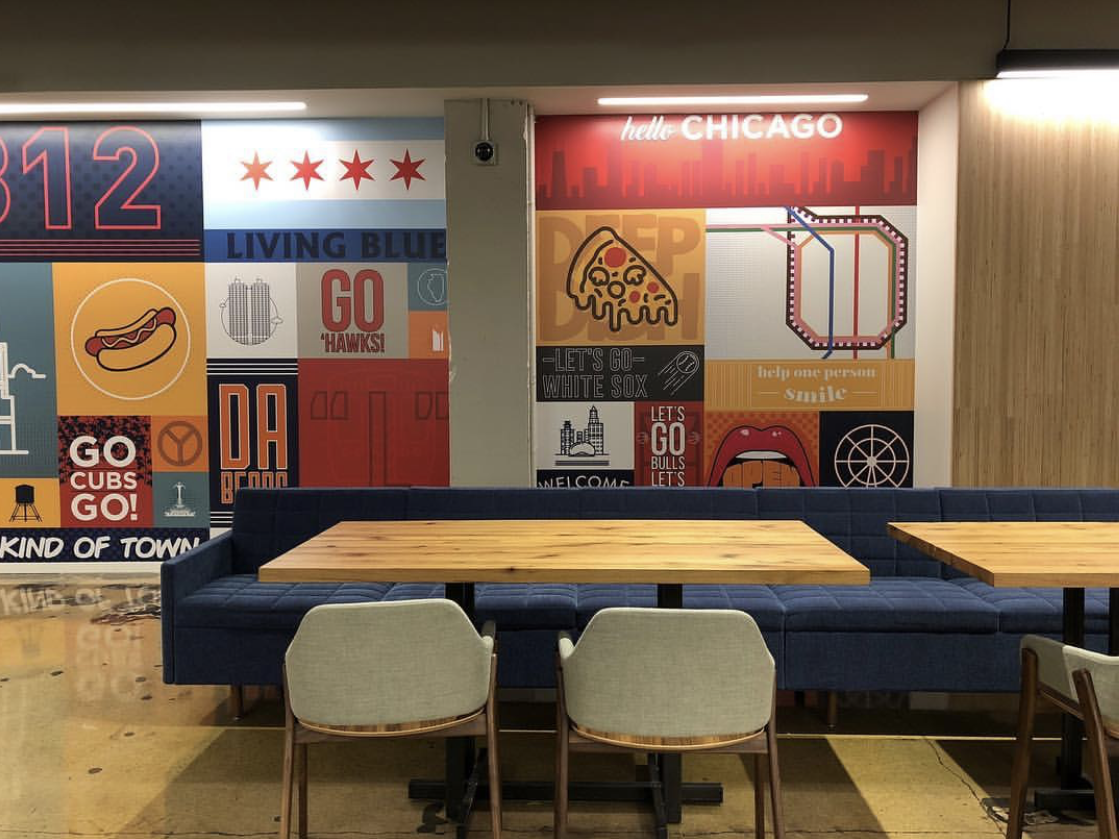
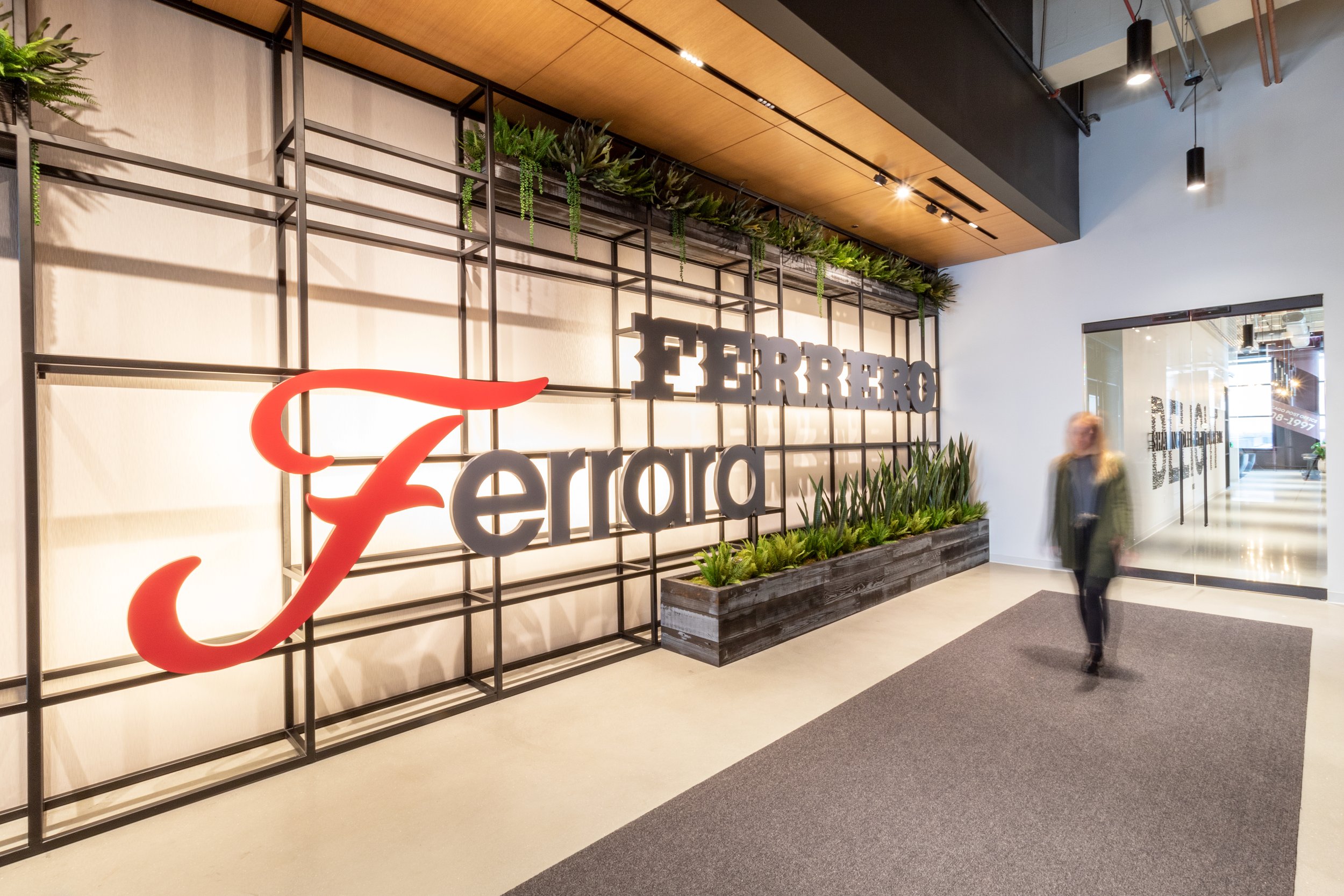
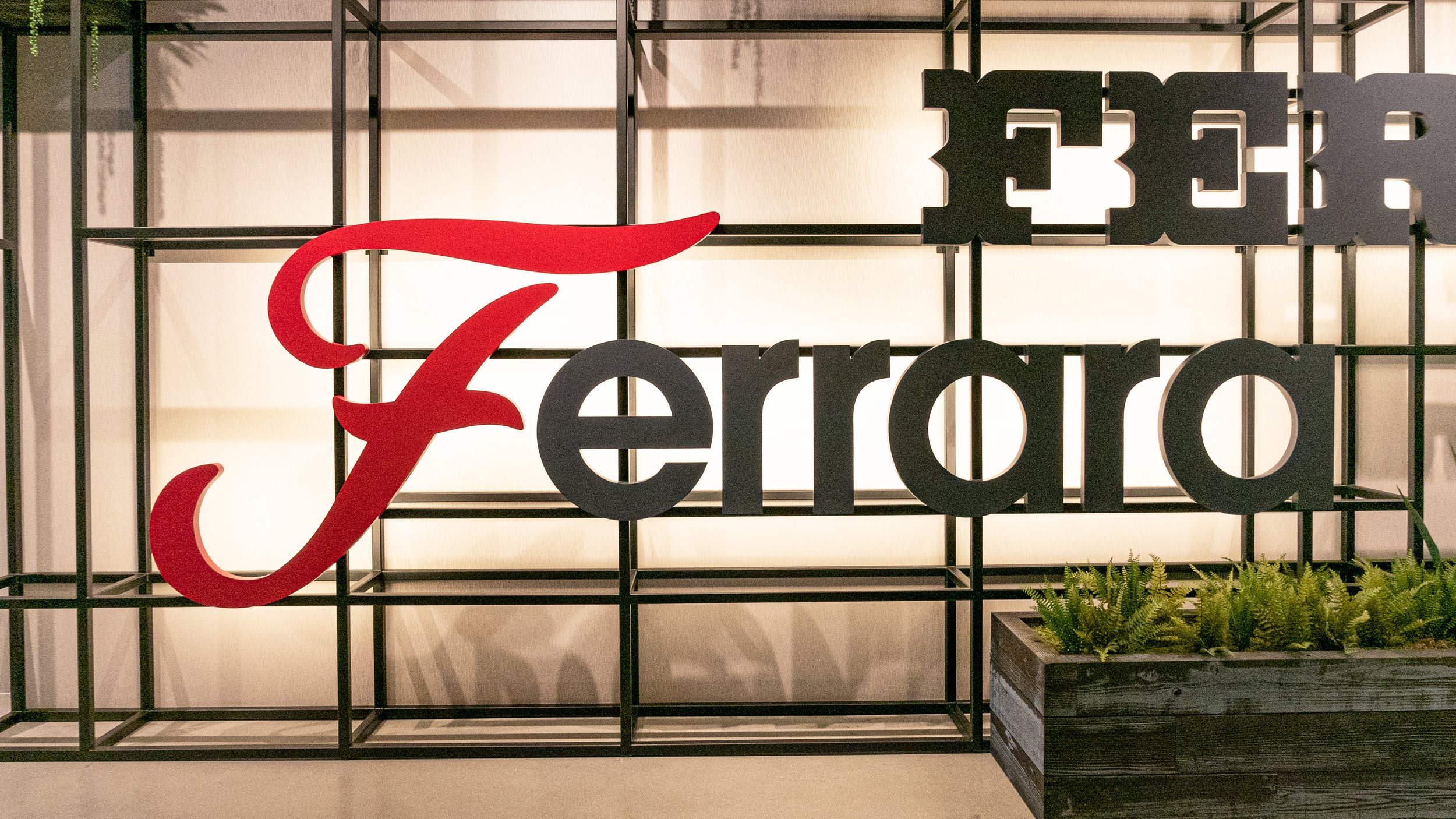
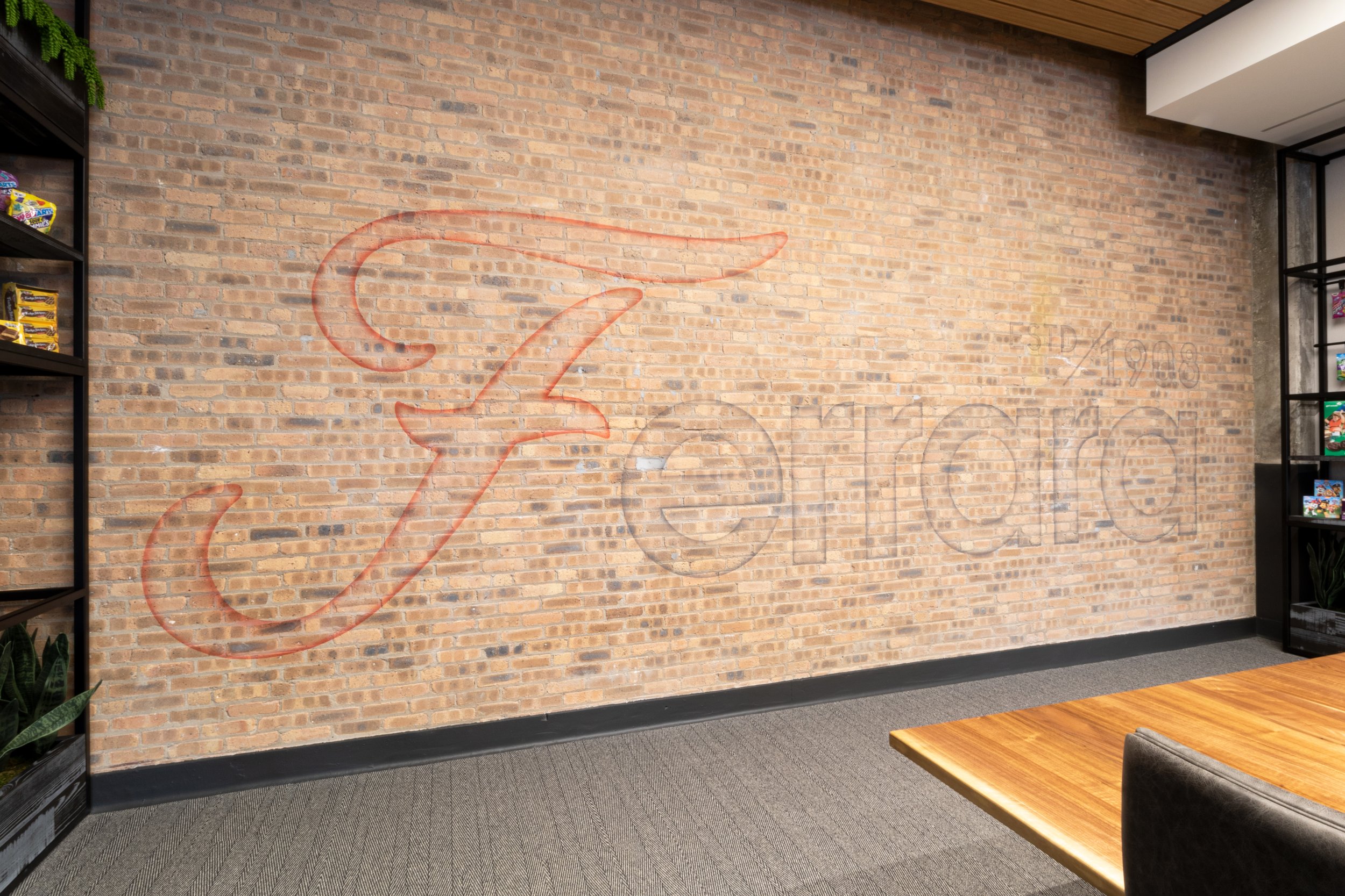
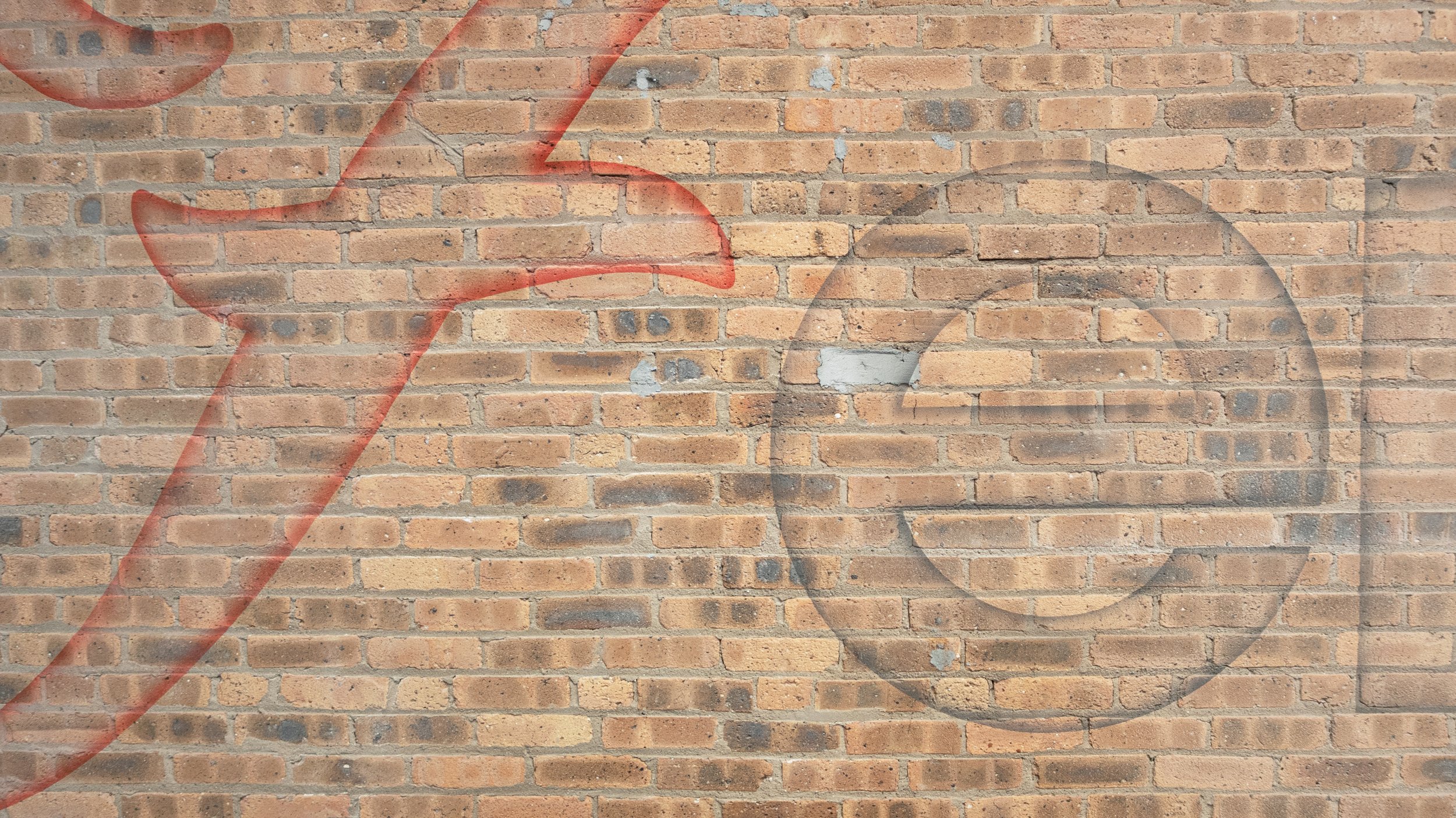
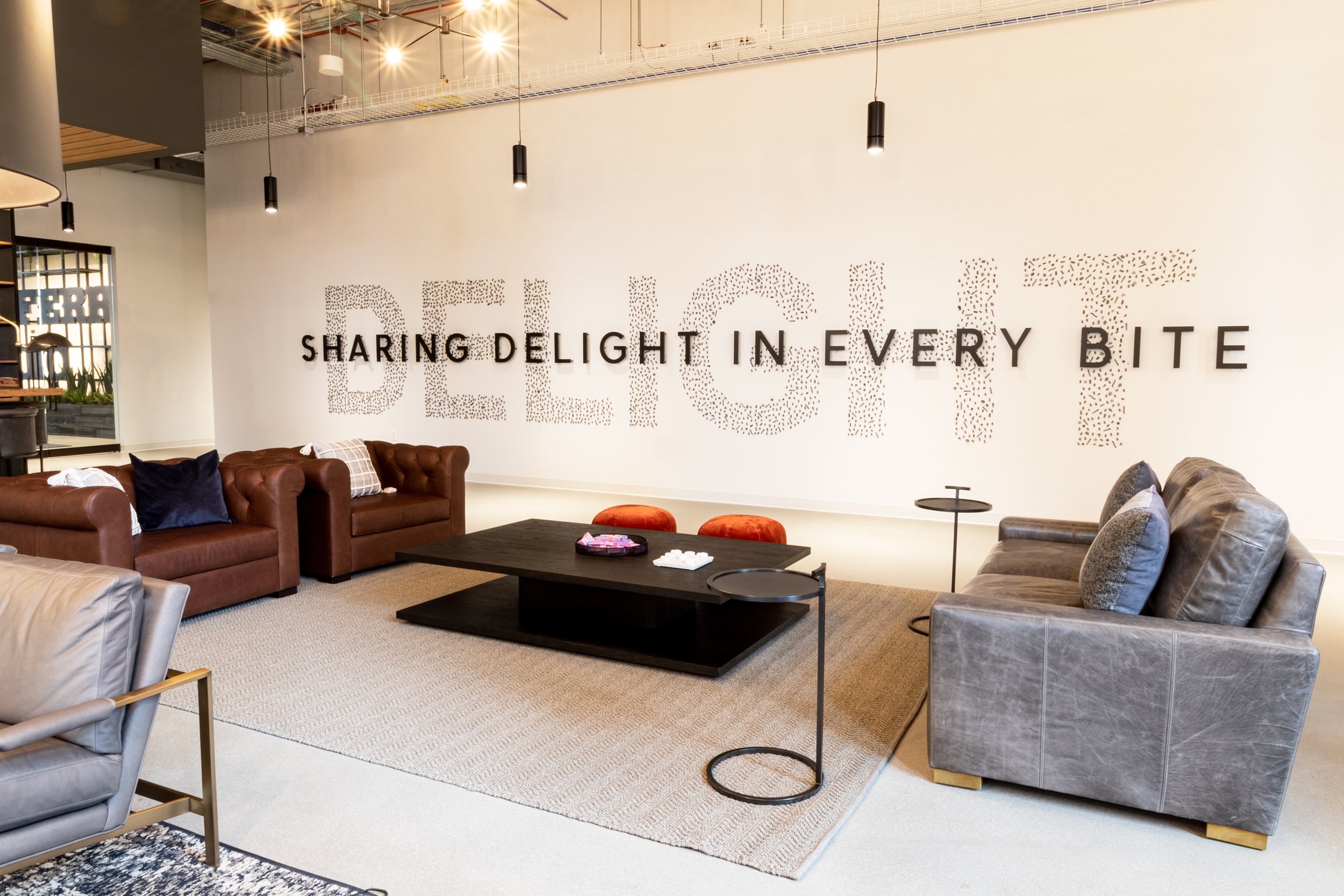
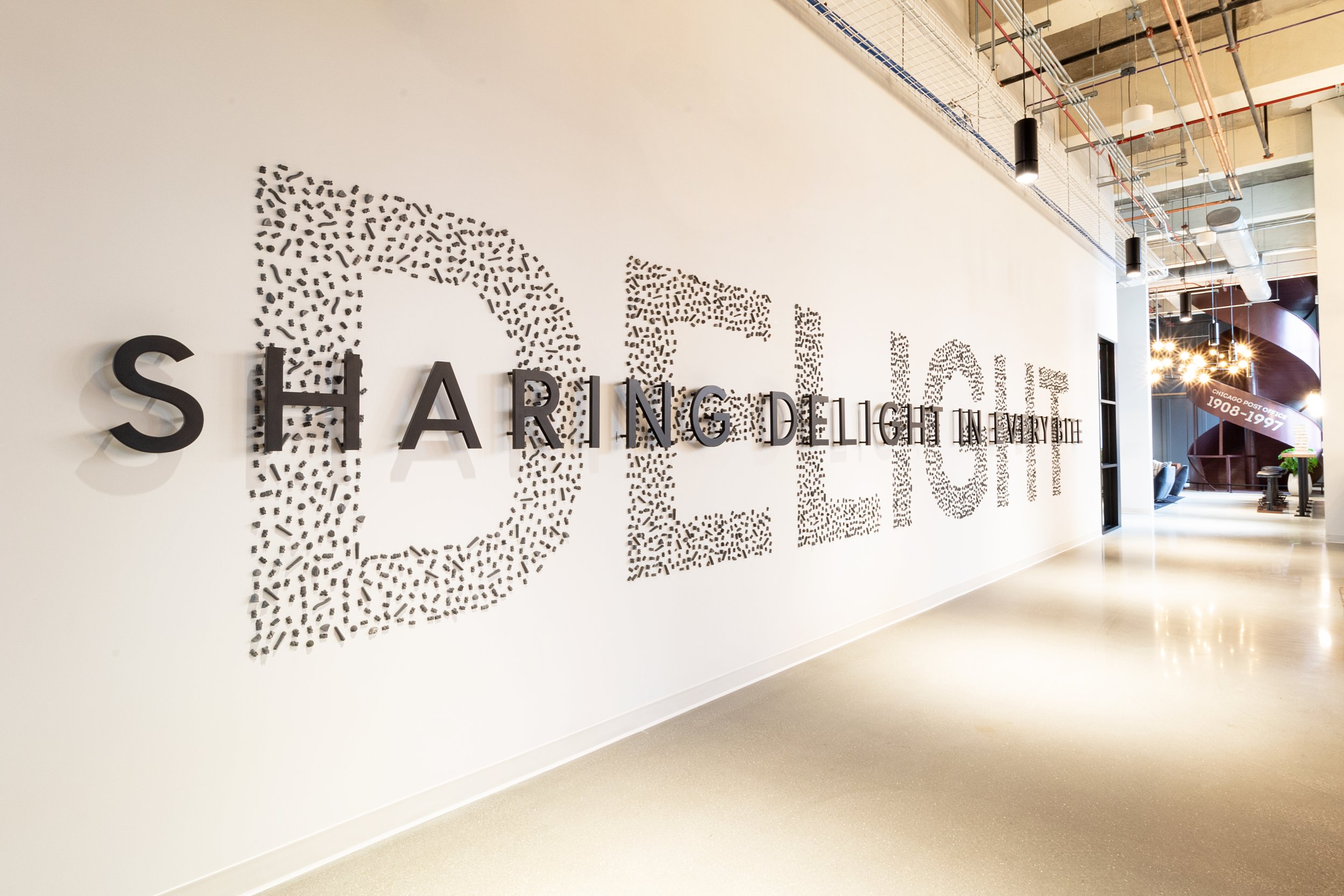
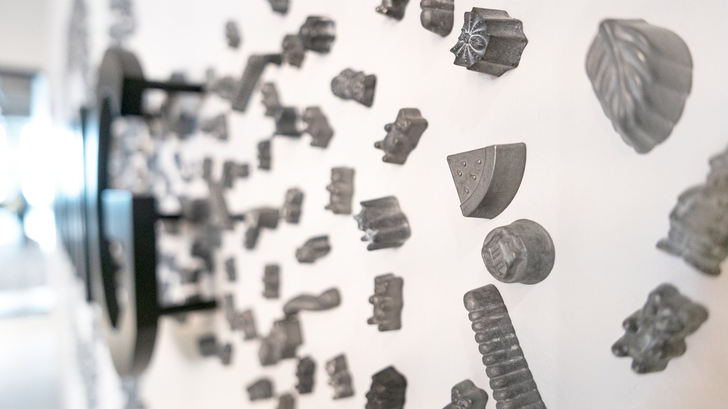
Ferrara Candy Company, an American candy manufacturer based in Chicago, Illinois, was the first tenant in Chicago’s Old Post Off ice. The branding elements marry the rich history of the iconic building with their iconic candy brands. Newly created moments throughout the space speak to products and values of their fun, hardworking, growing company culture. This was a collaboration project with NELSON, while working at Partners by Design/Spark.
This was a very special project and another personal favorite.

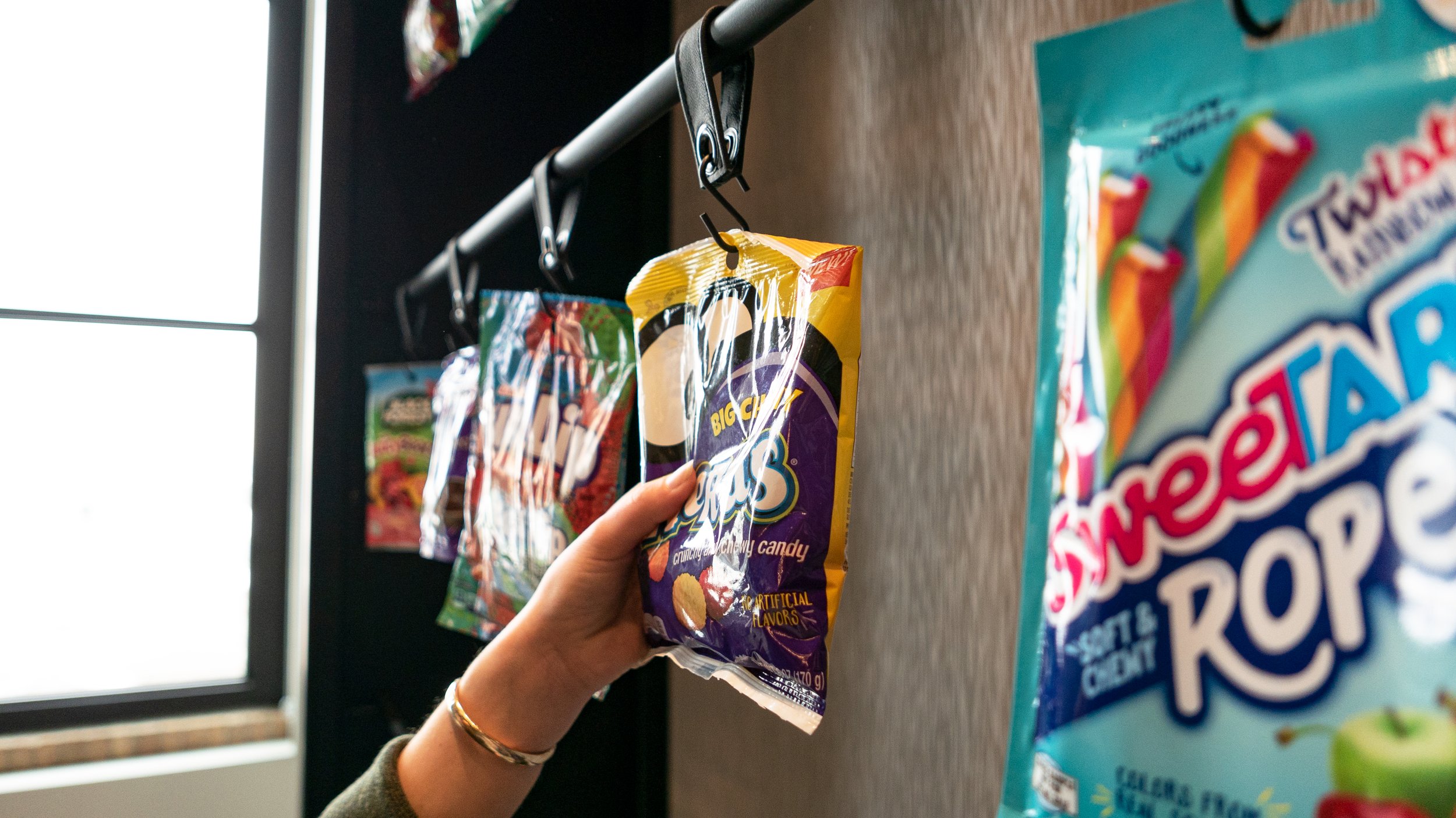


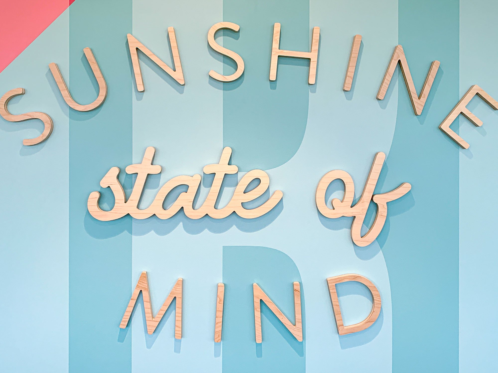
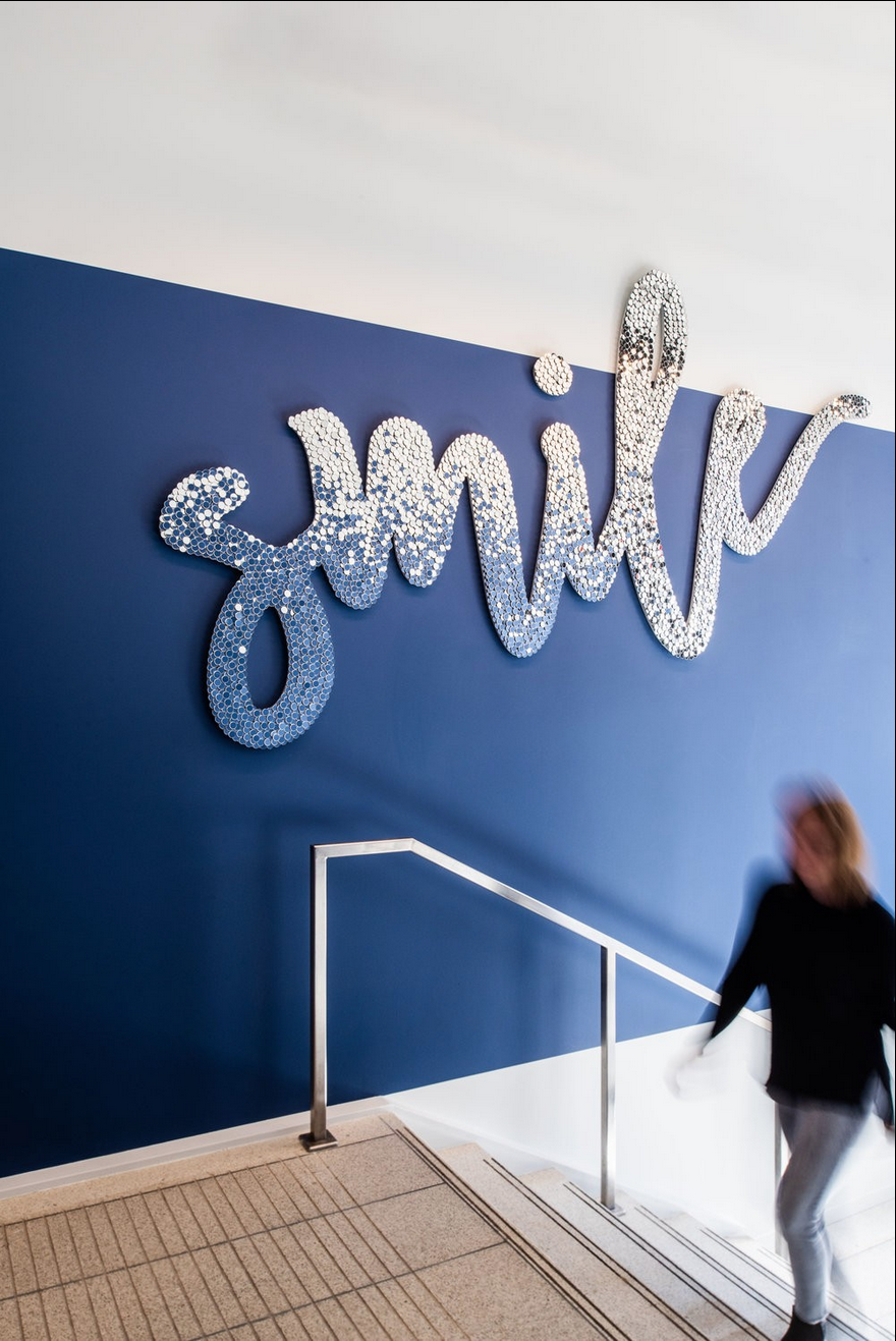
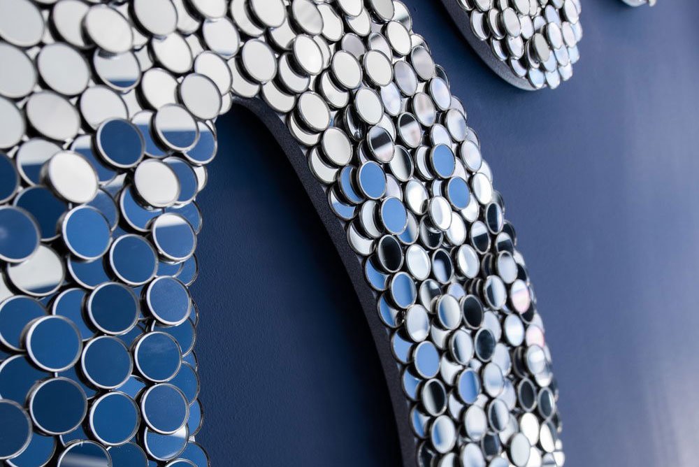
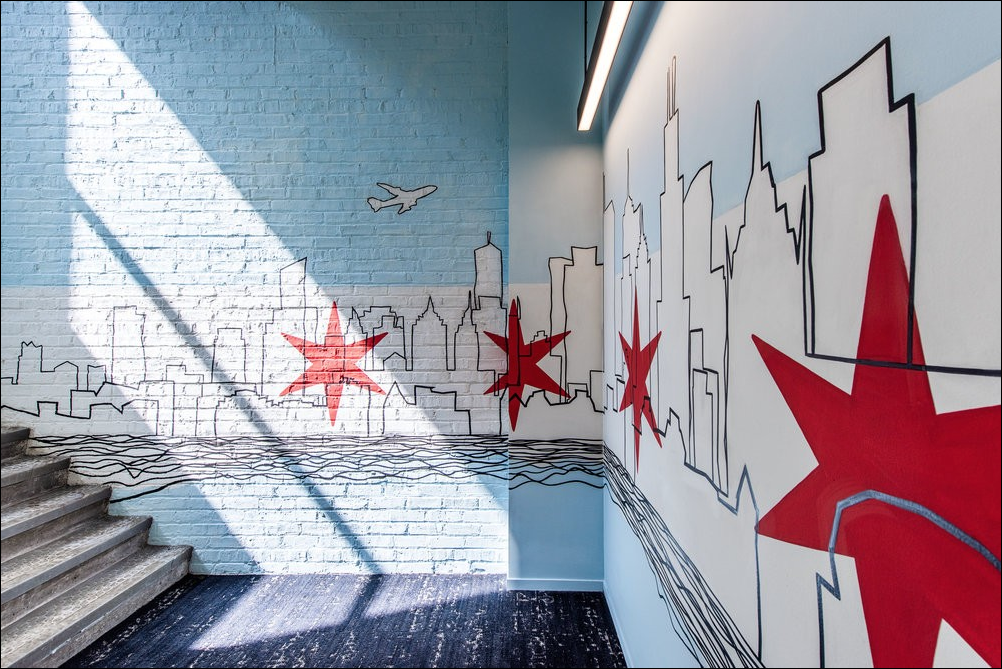
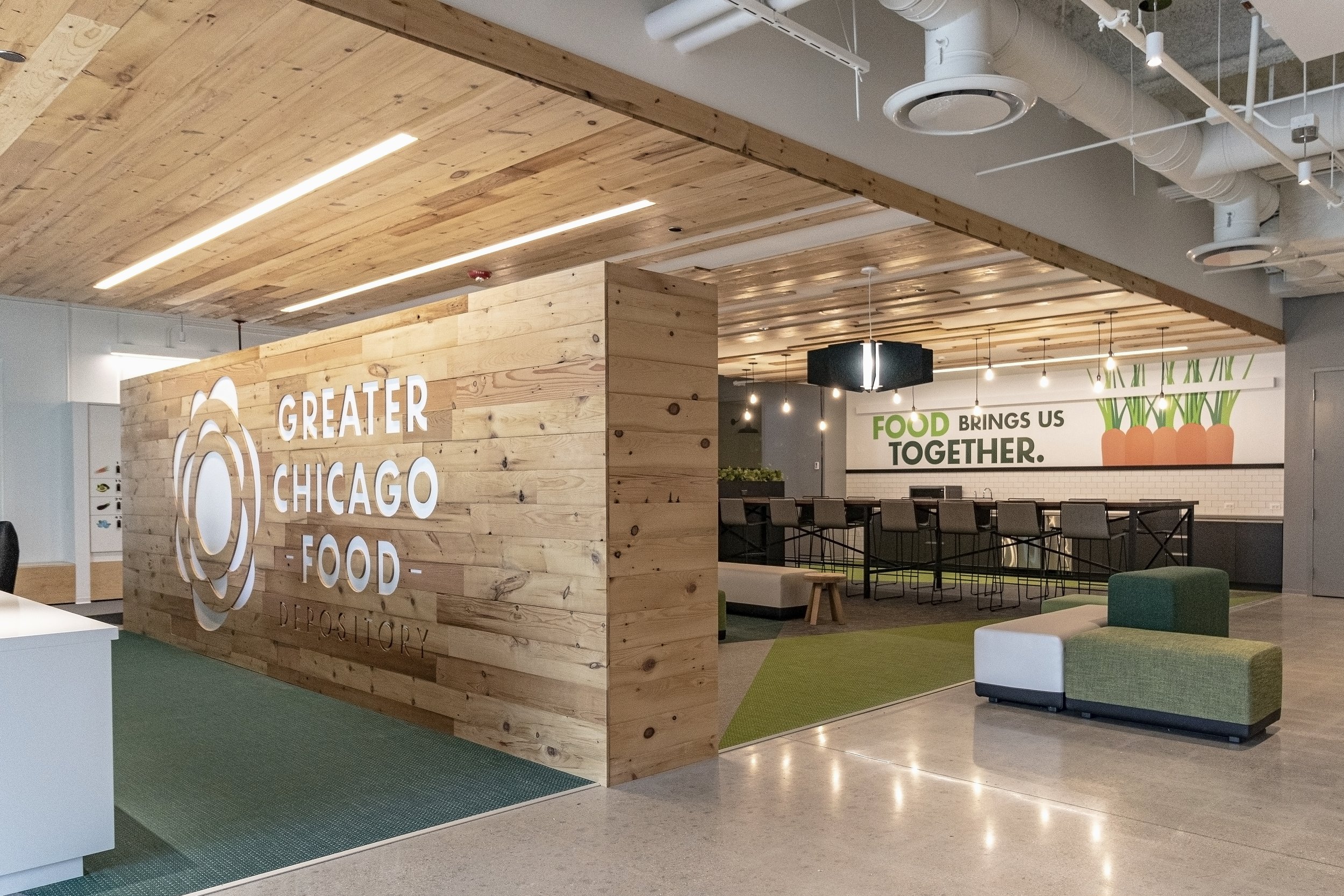
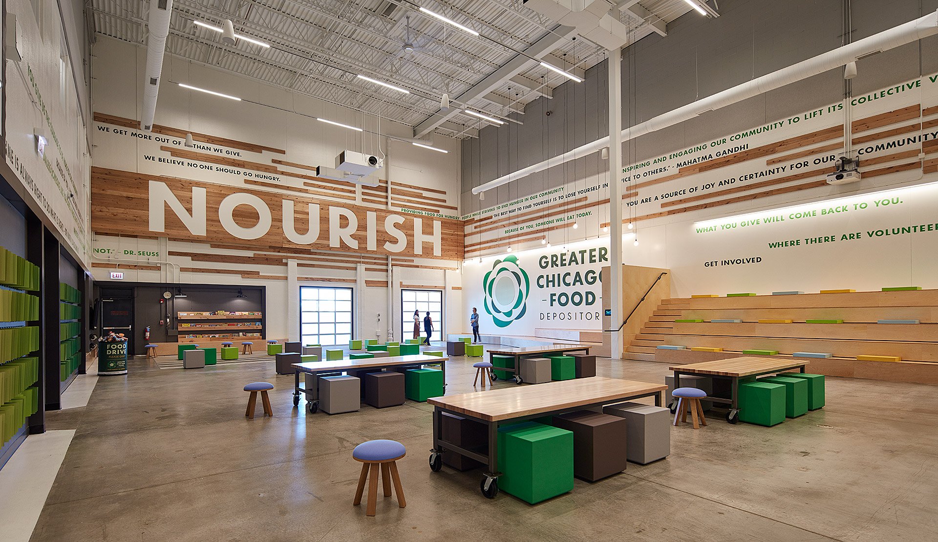
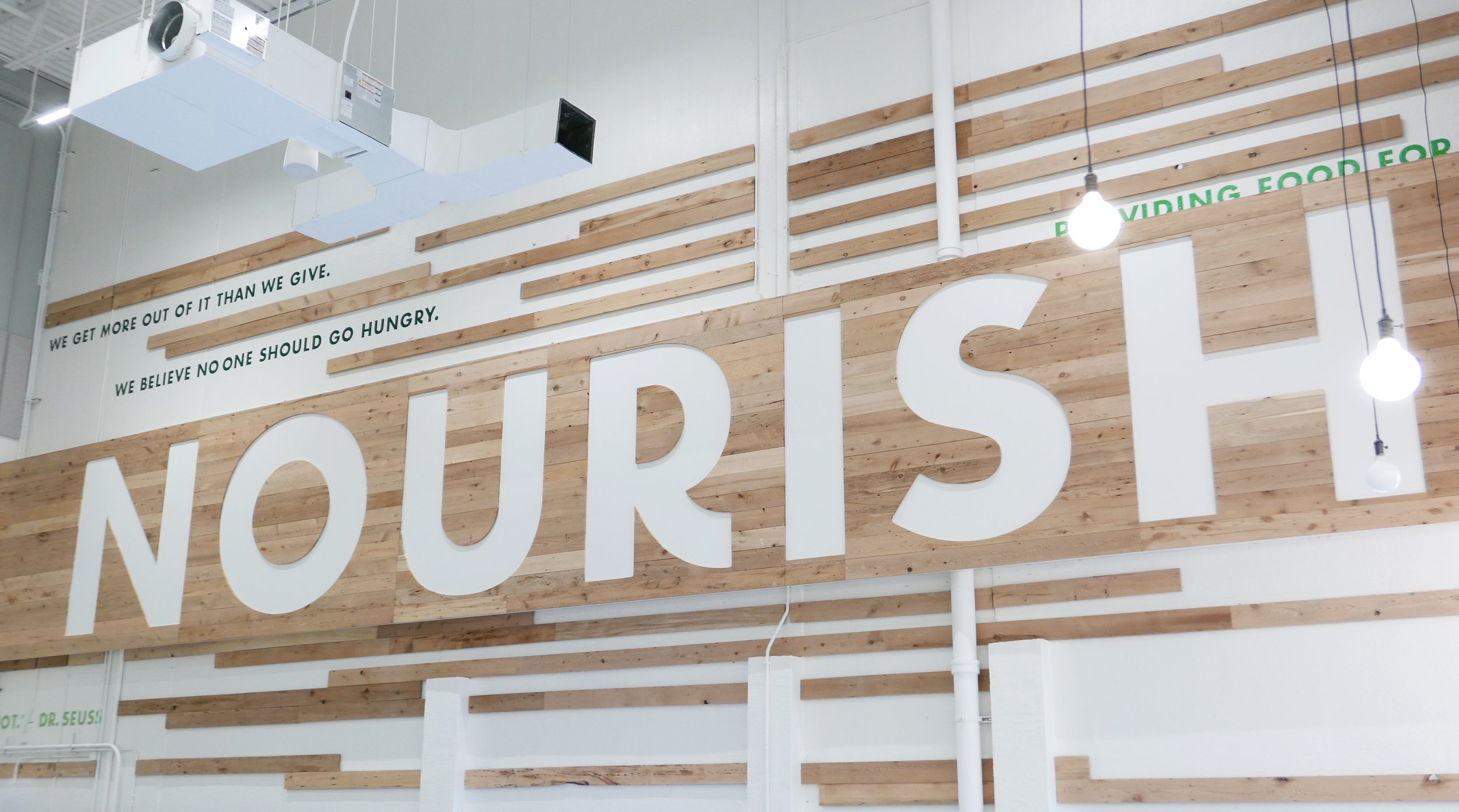
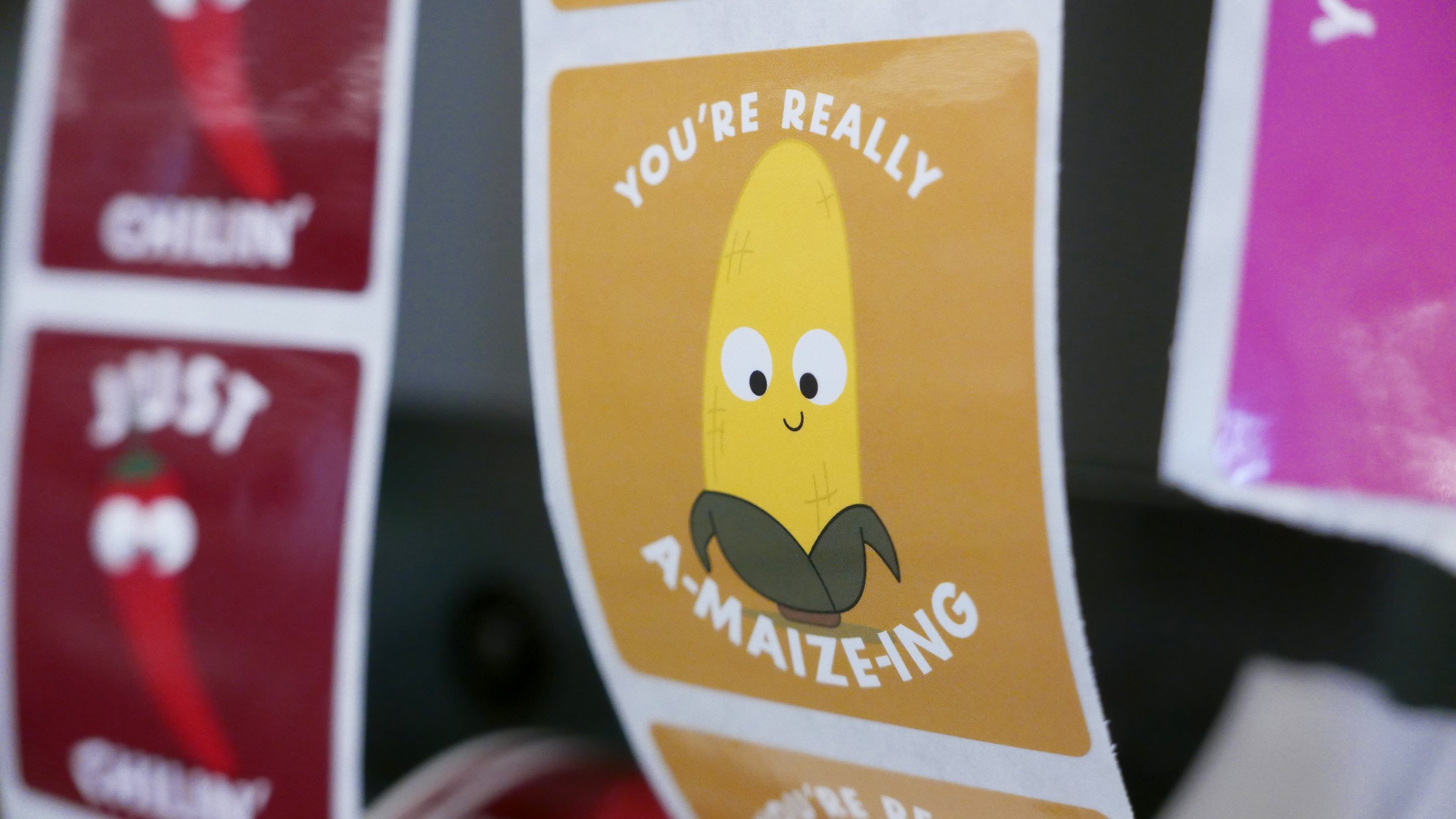
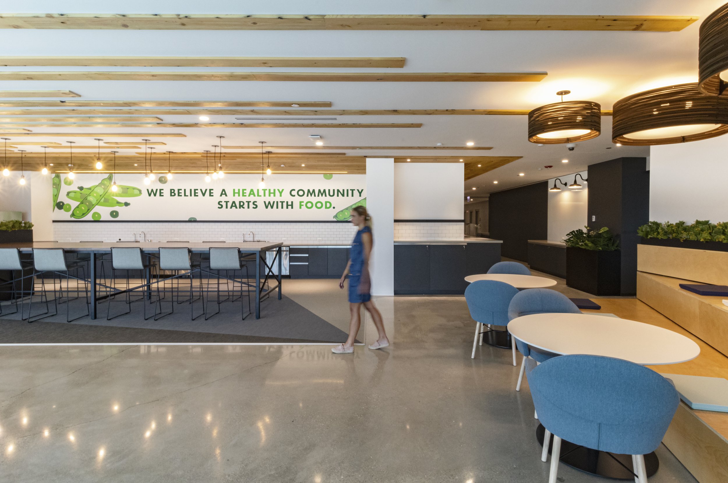
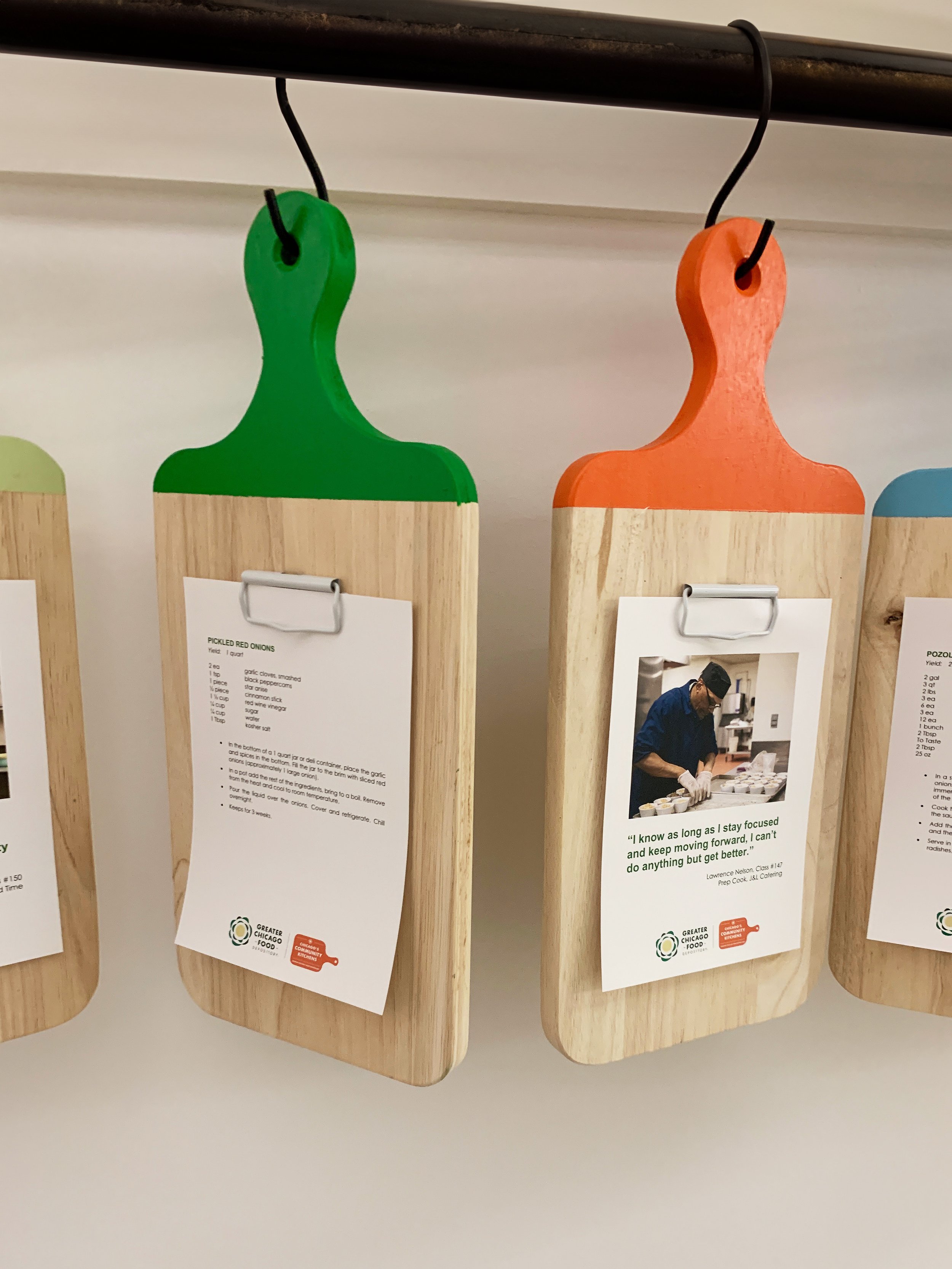
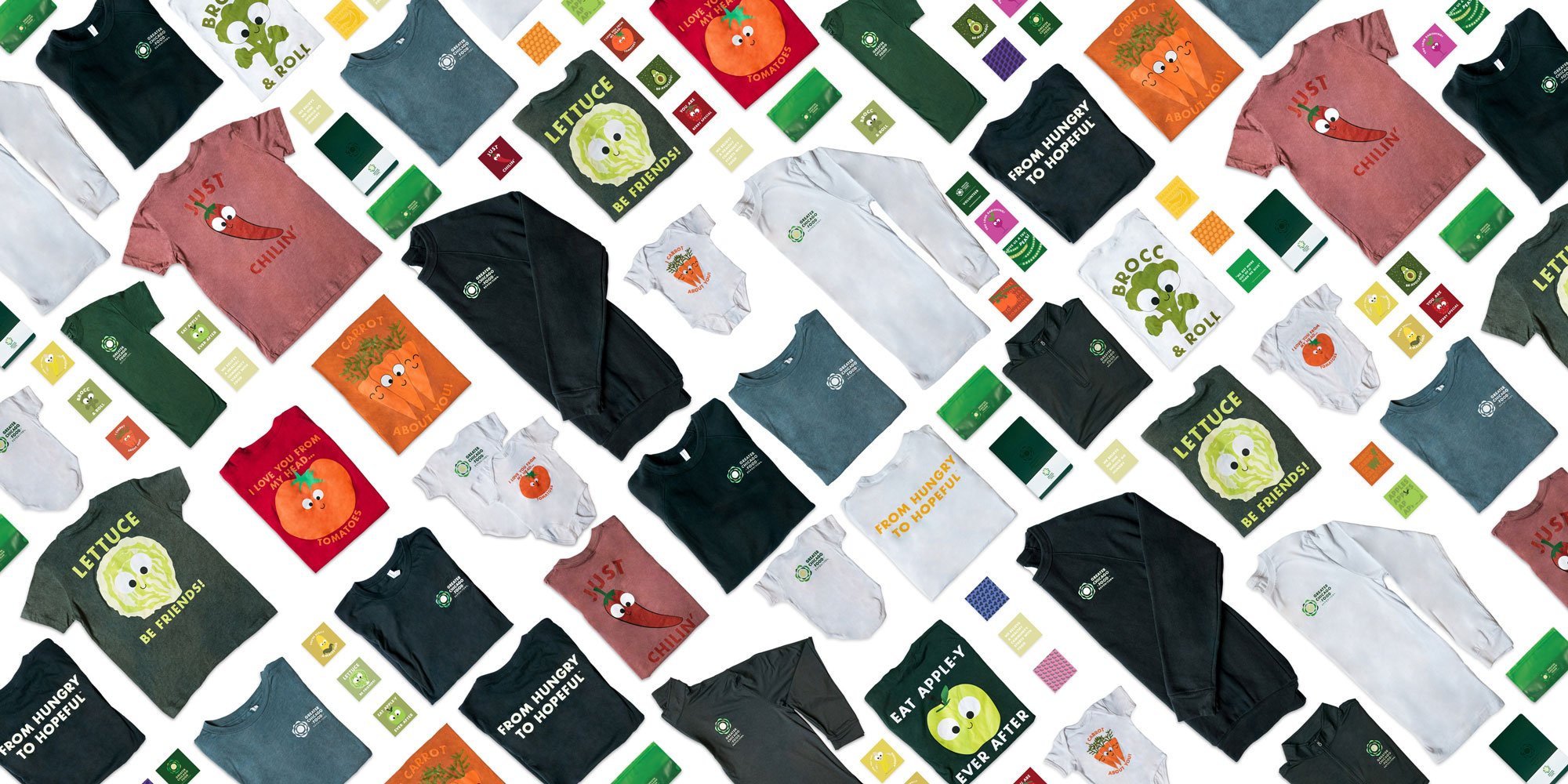
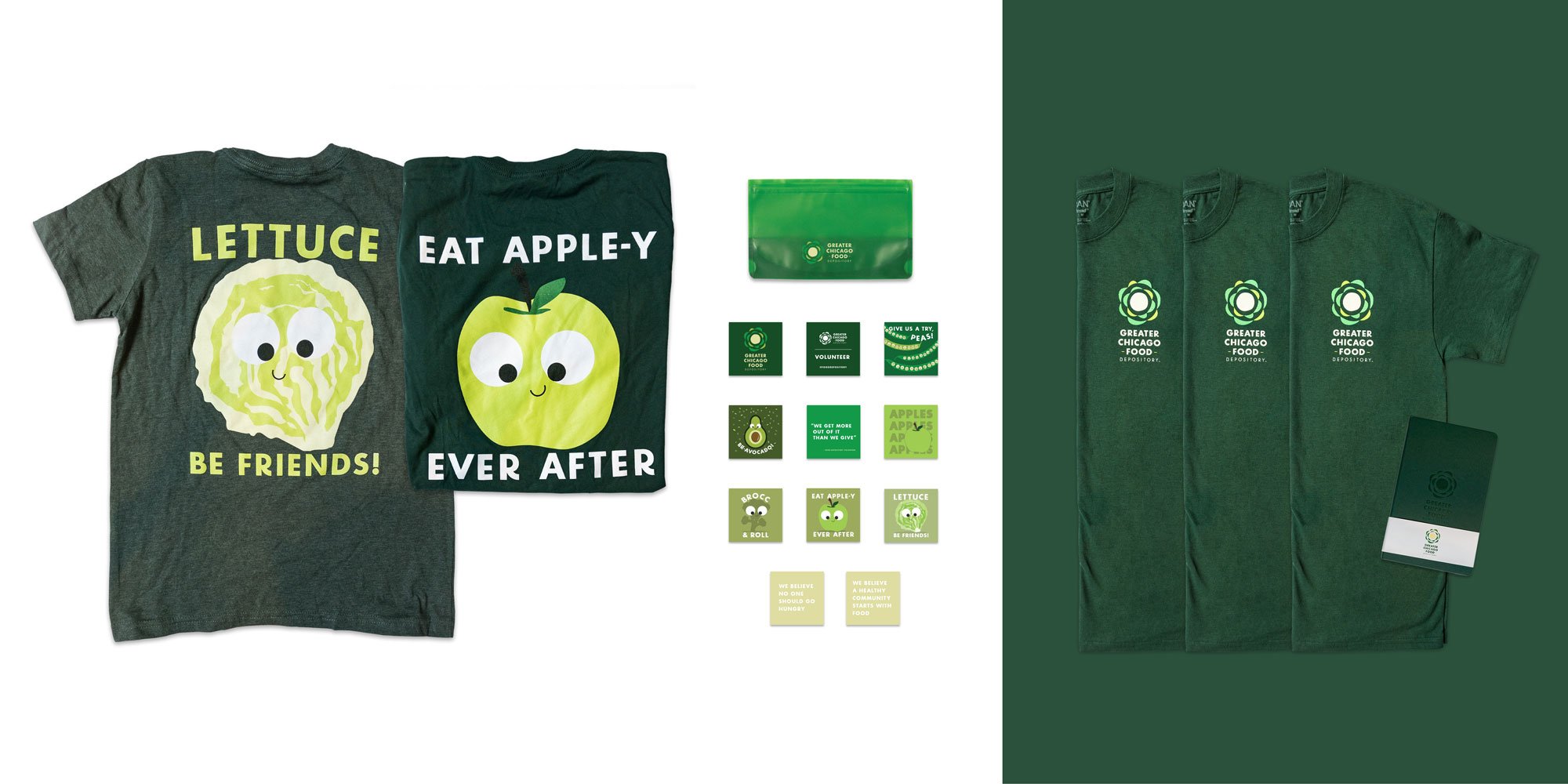
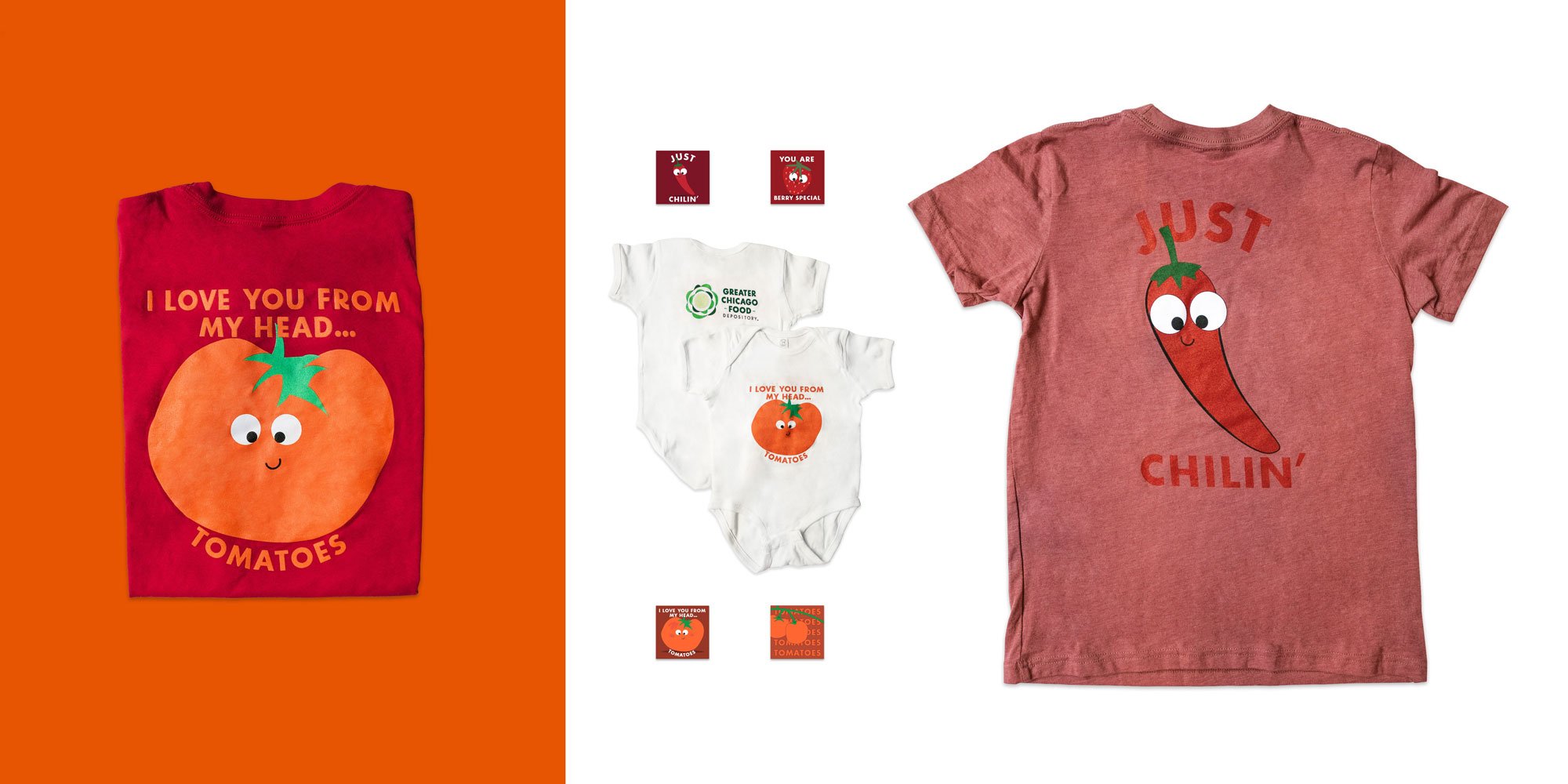
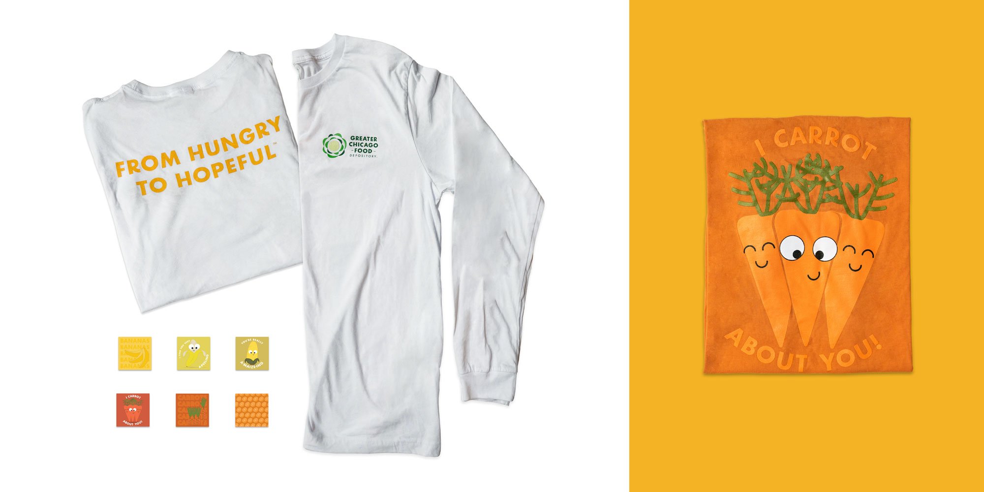
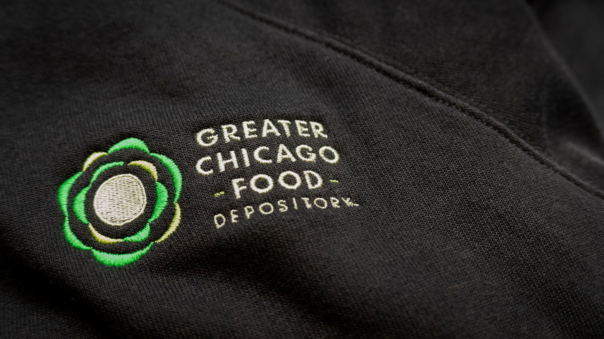
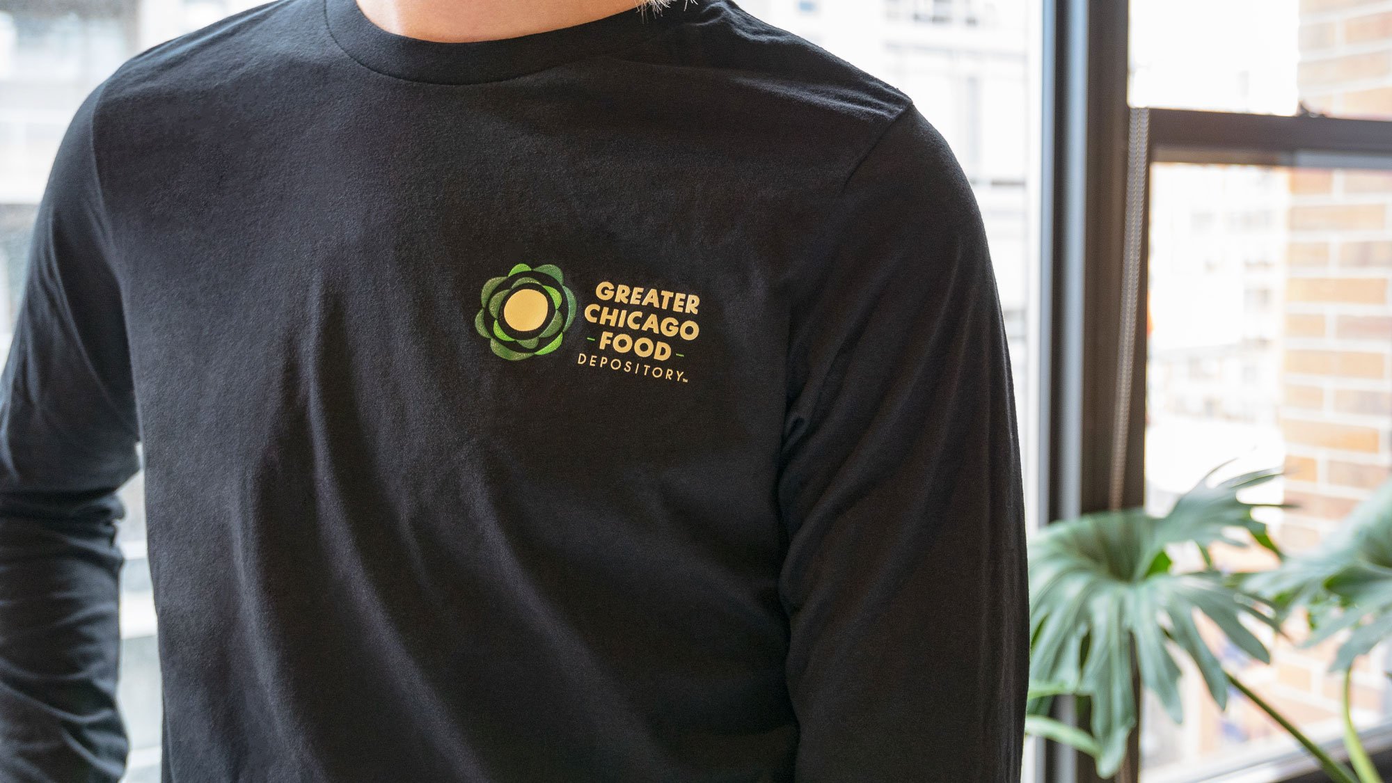
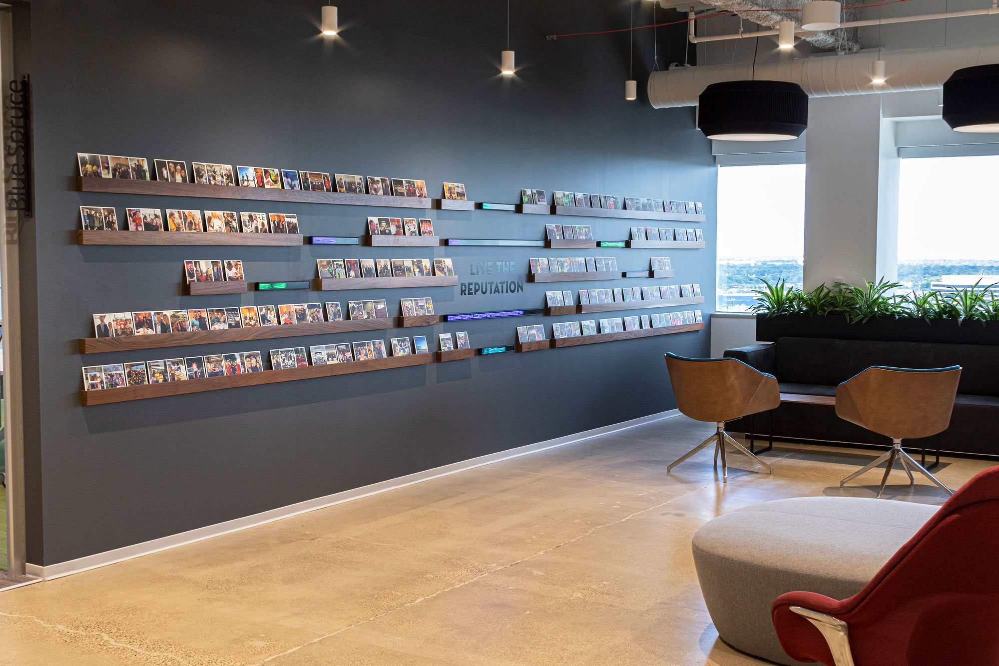
The Greater Chicago Food Depository (GCFD) makes a daily impact on hunger by distributing nutritious food across Chicago and Cook County. Their new volunteer orientation space informs visitors of the incredible work employees perform each day and inspires the community to support their mission. Fun fact -President Obama signed the chalk wall by “Hope”.
Office branding reminds employees to cultivate and celebrate progress daily (and to enjoy a good pun or two!). The assets we generated throughout this project developed into swag for their store. It was a very fulfilling project to be a part of - especially when you see people interacting with all the branded elements.


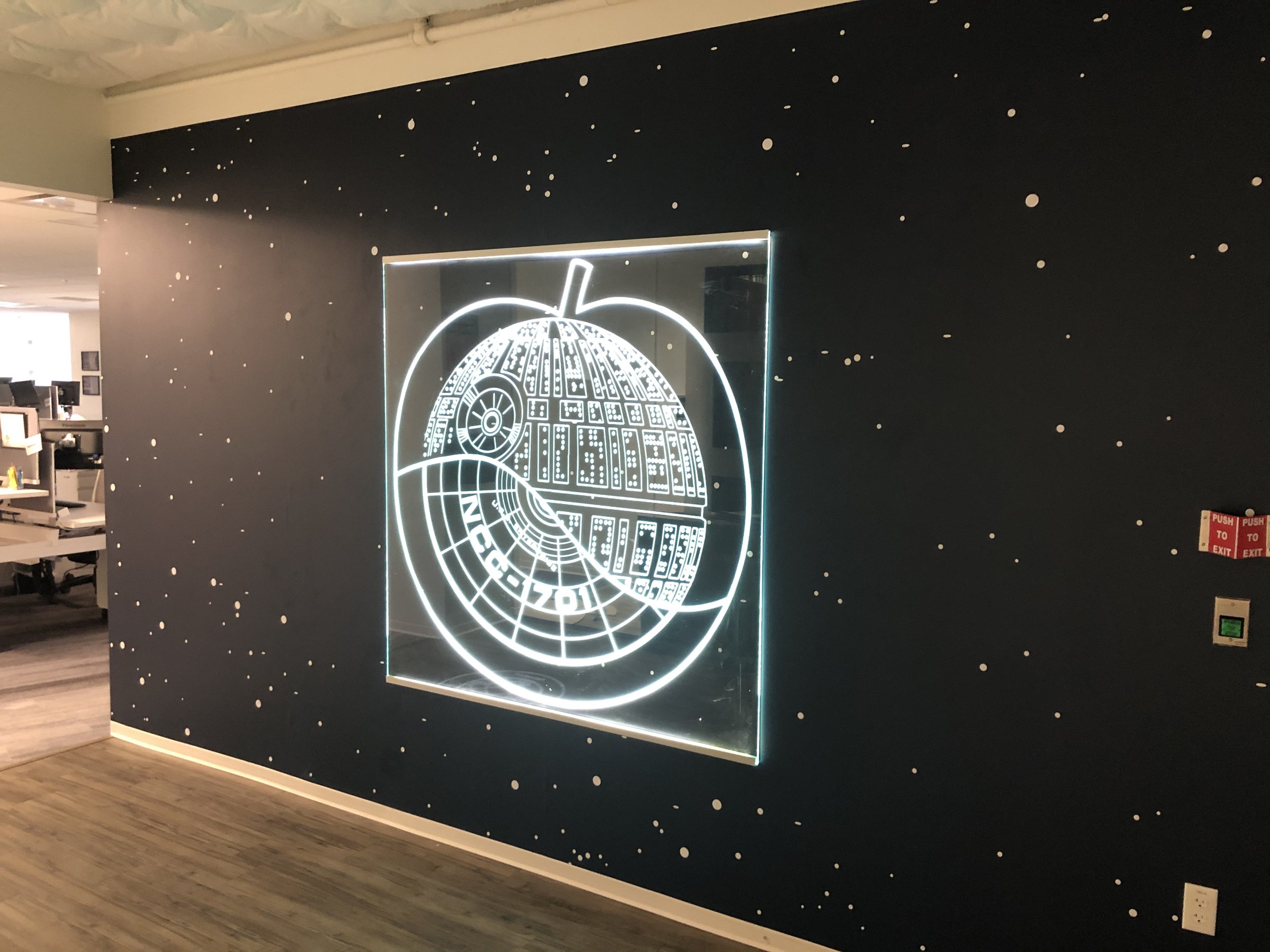
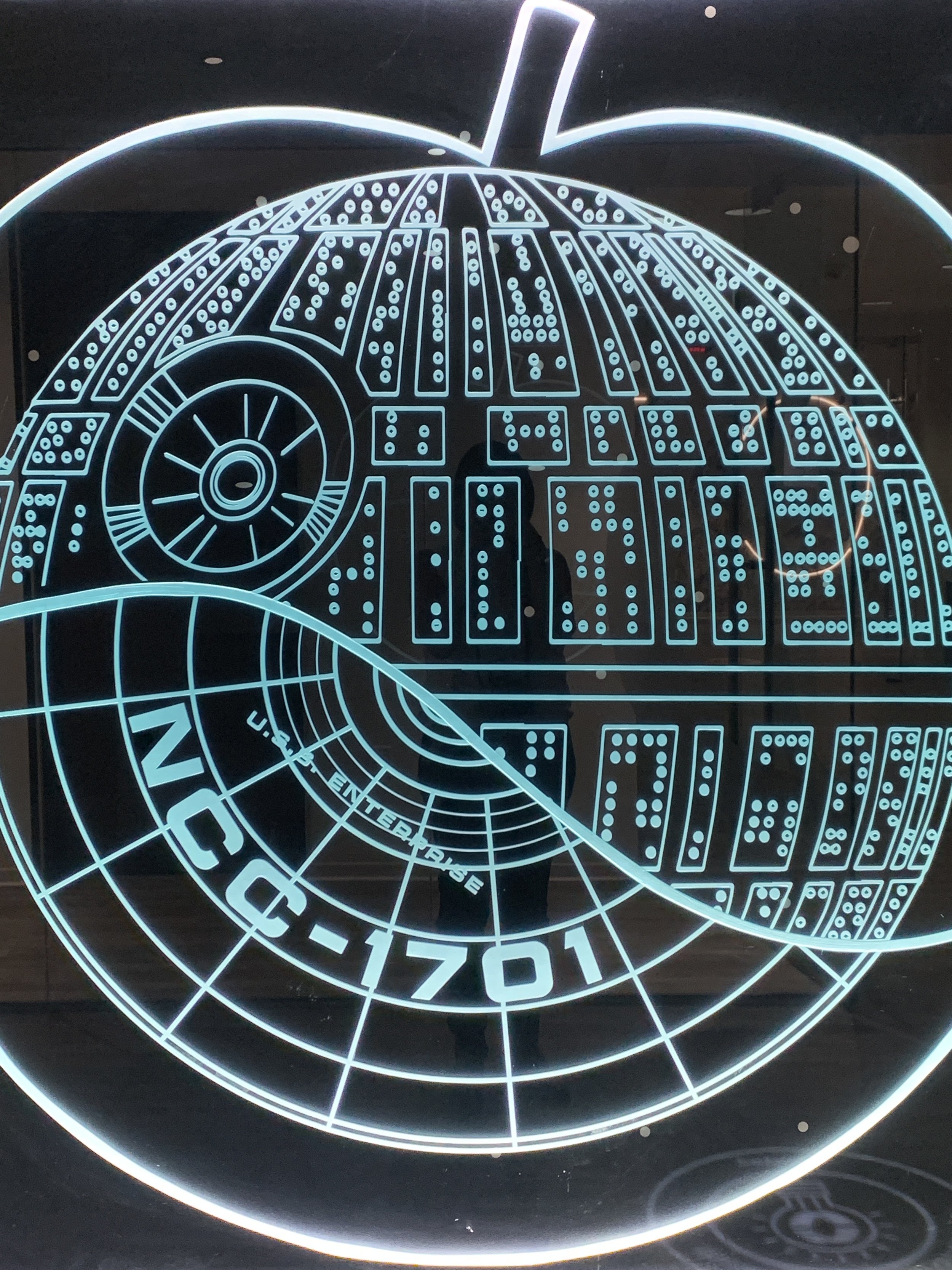
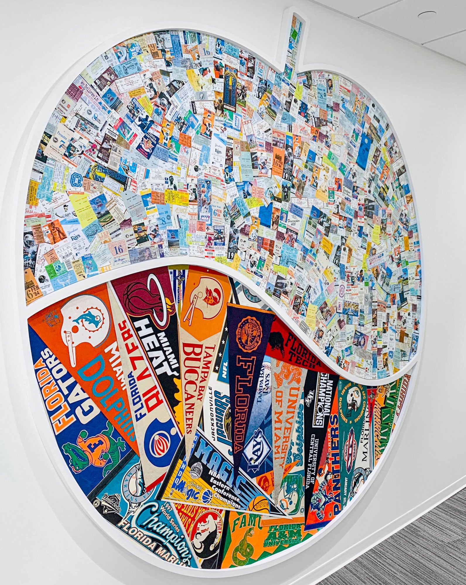
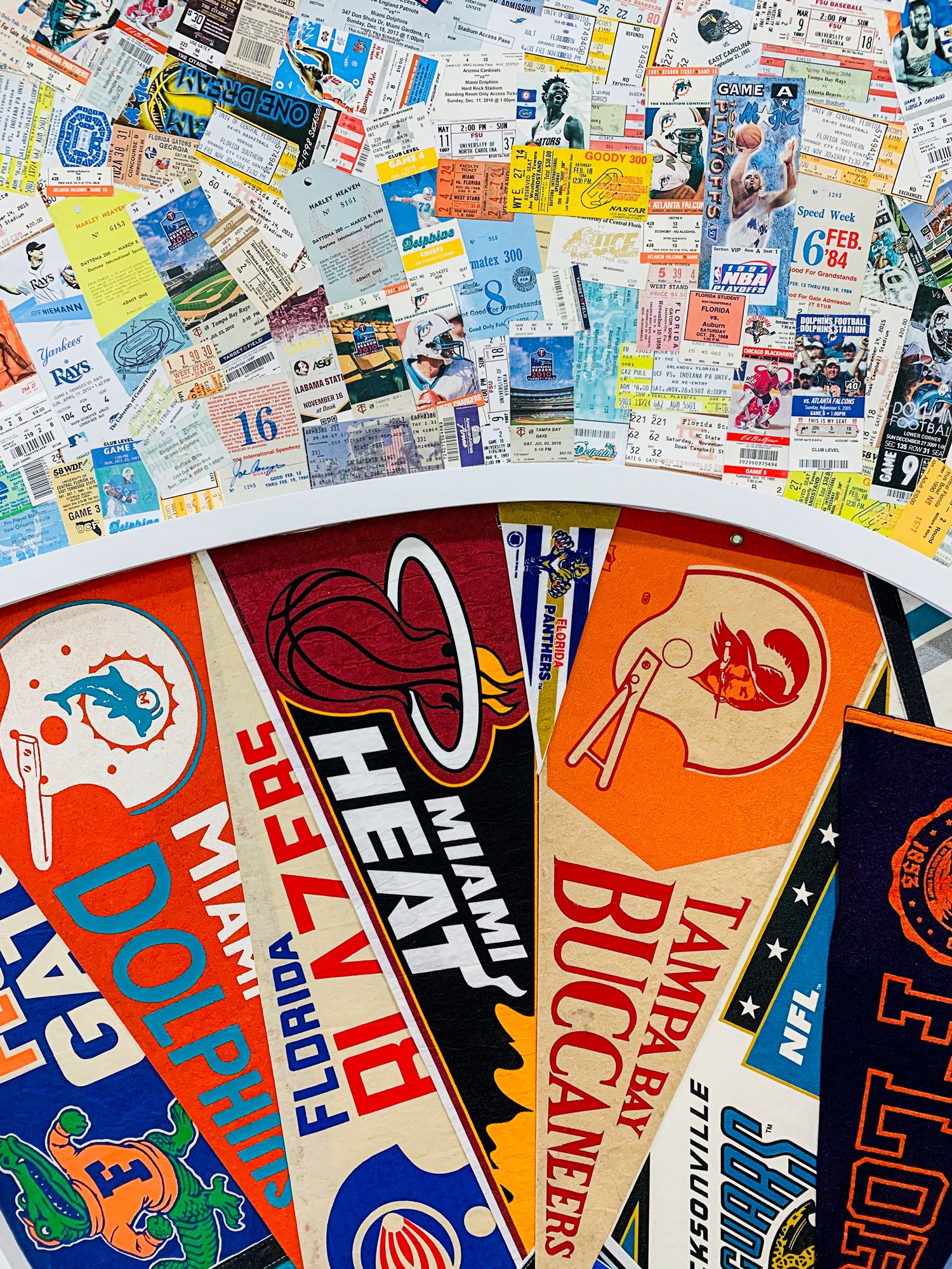
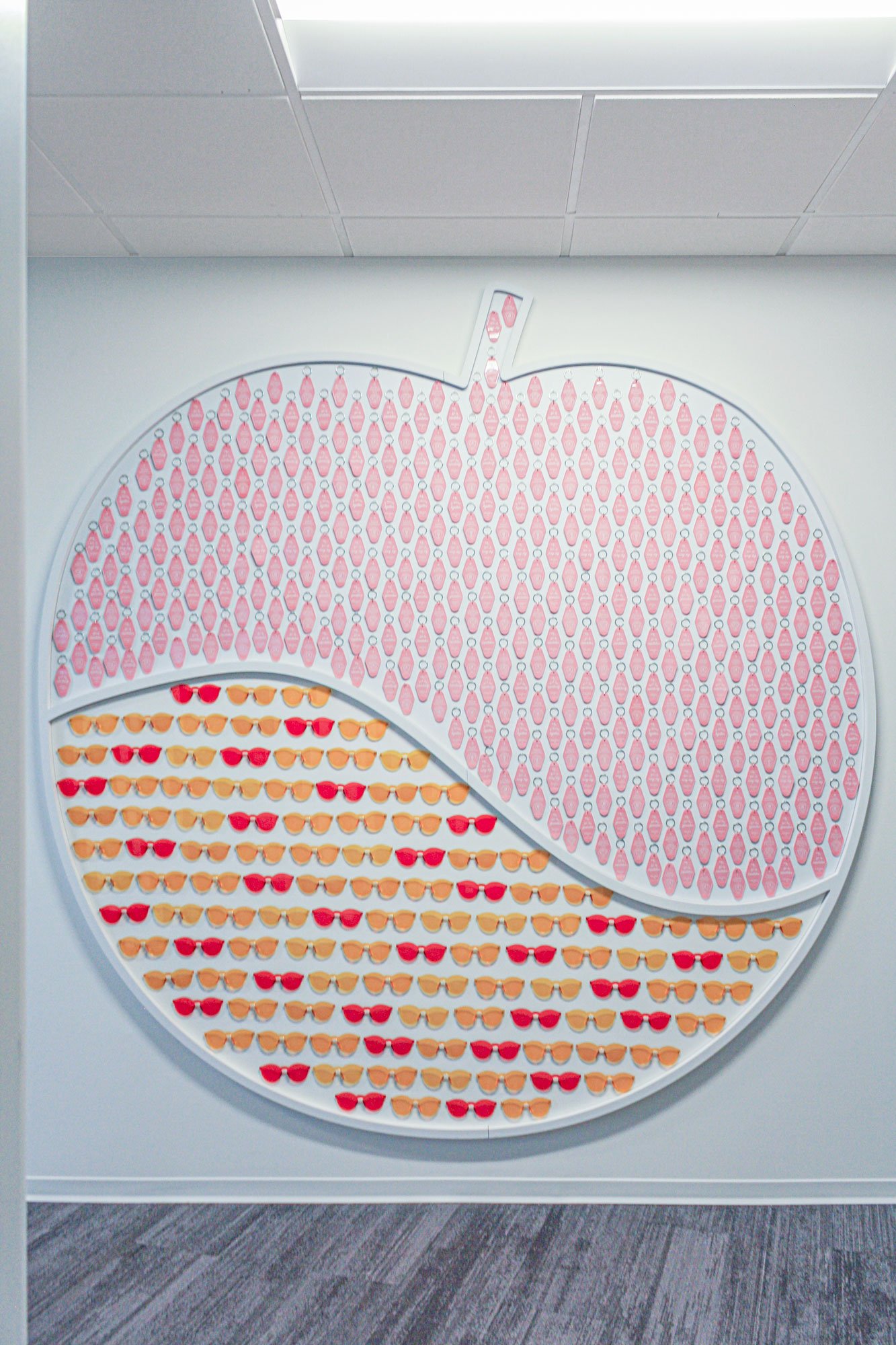
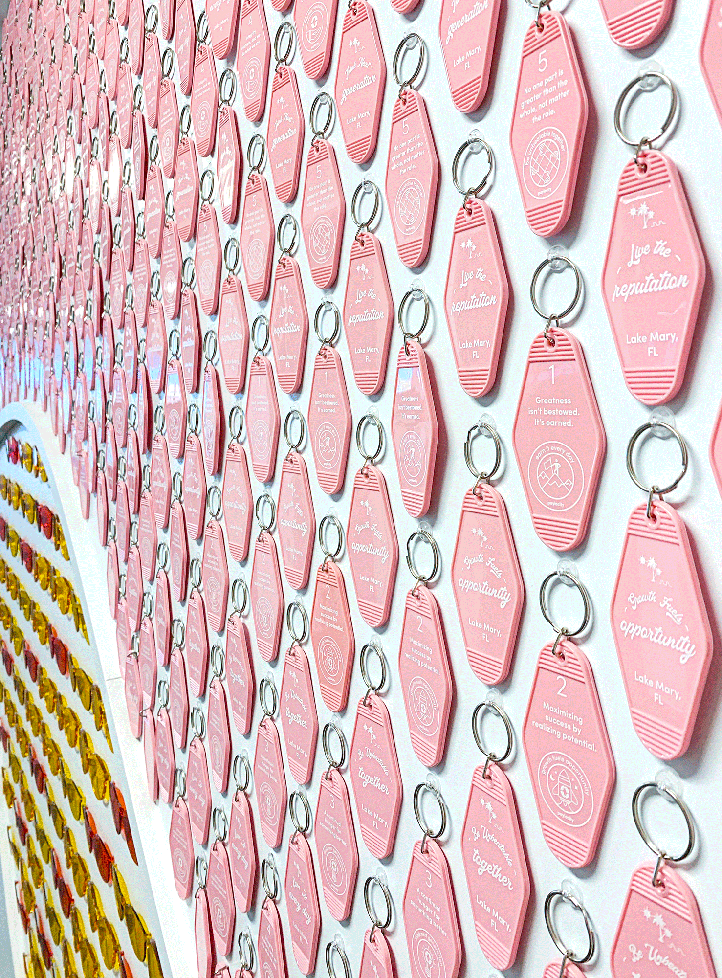
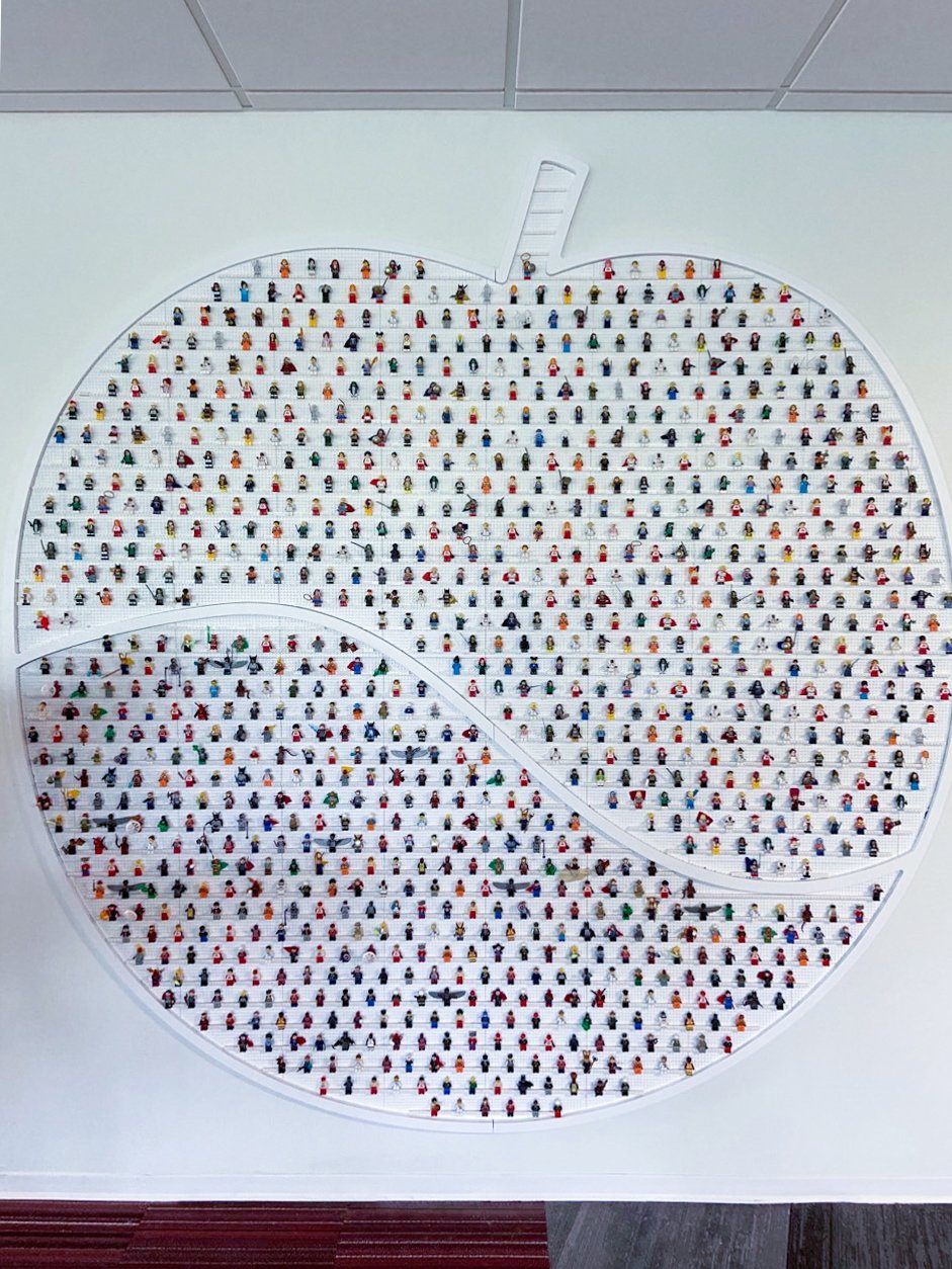
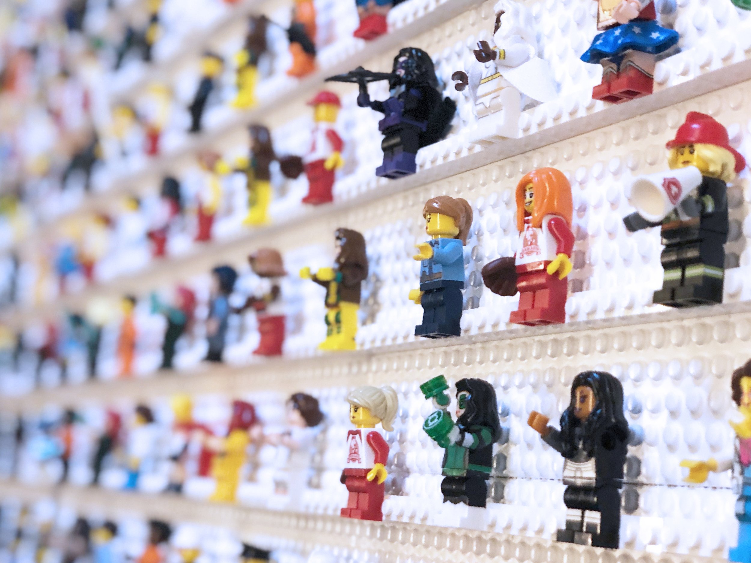
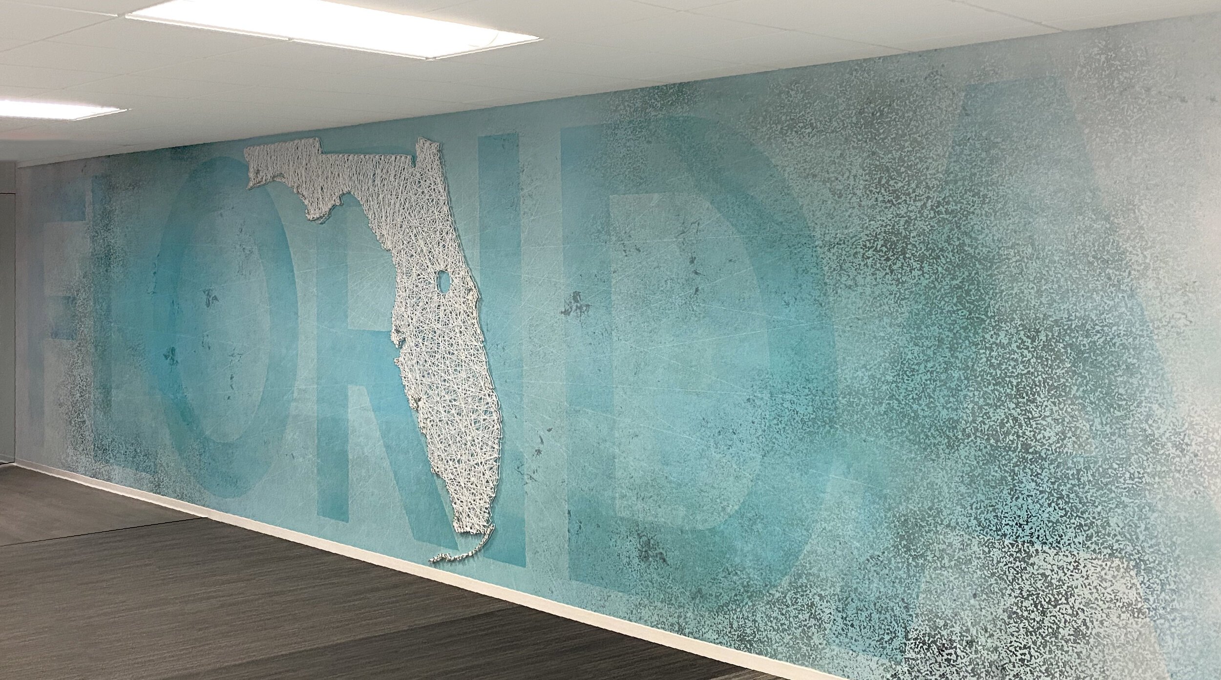
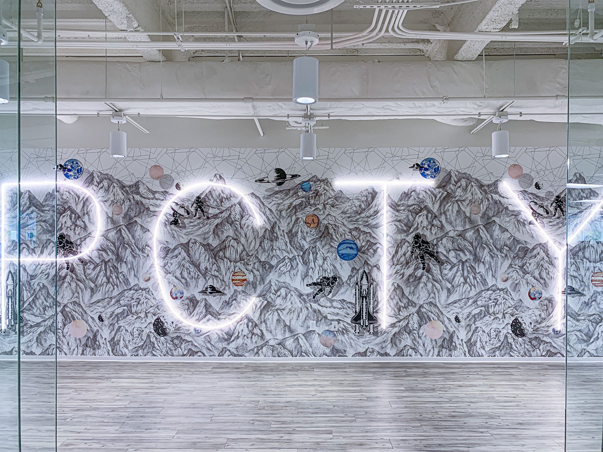
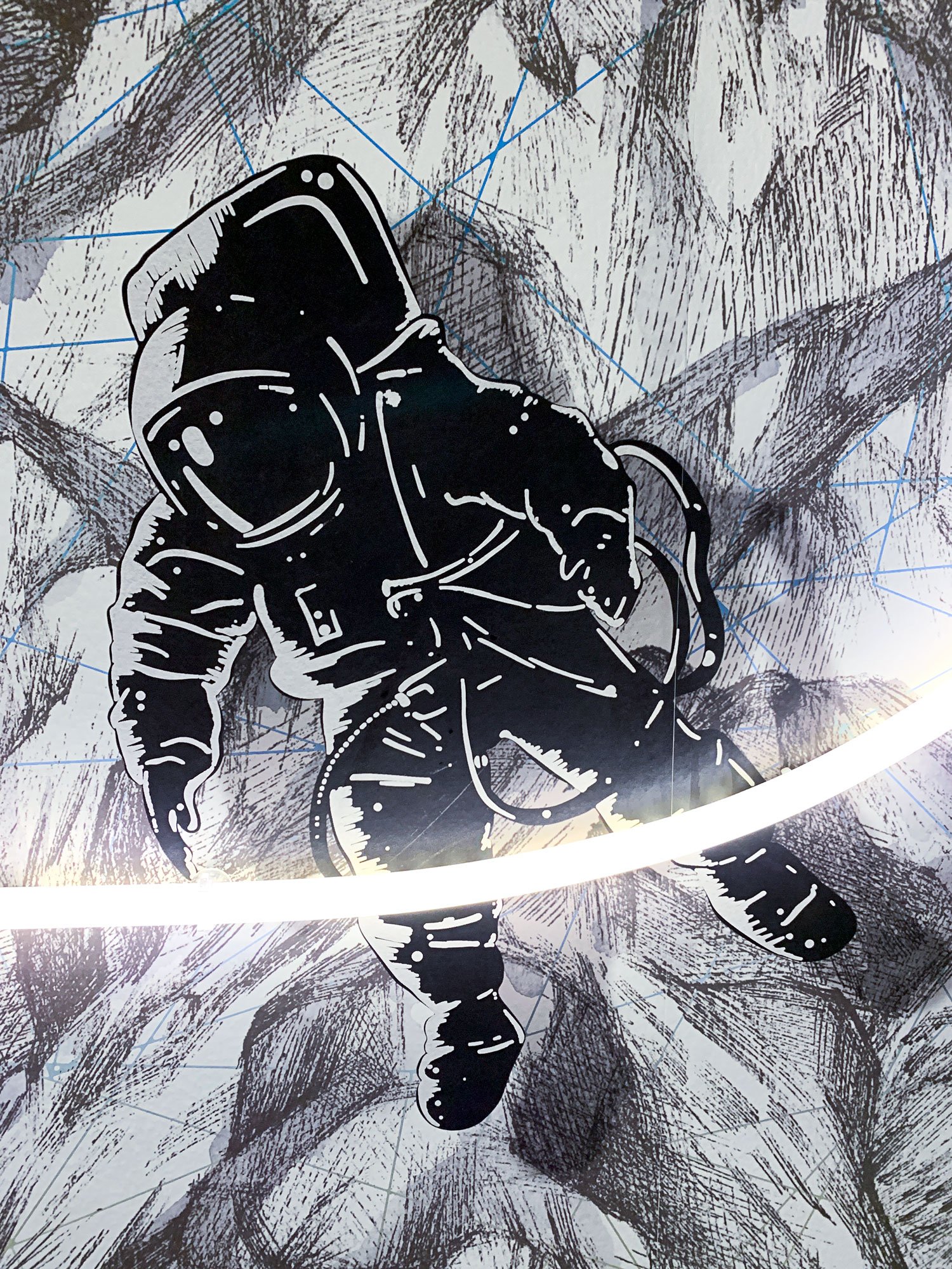
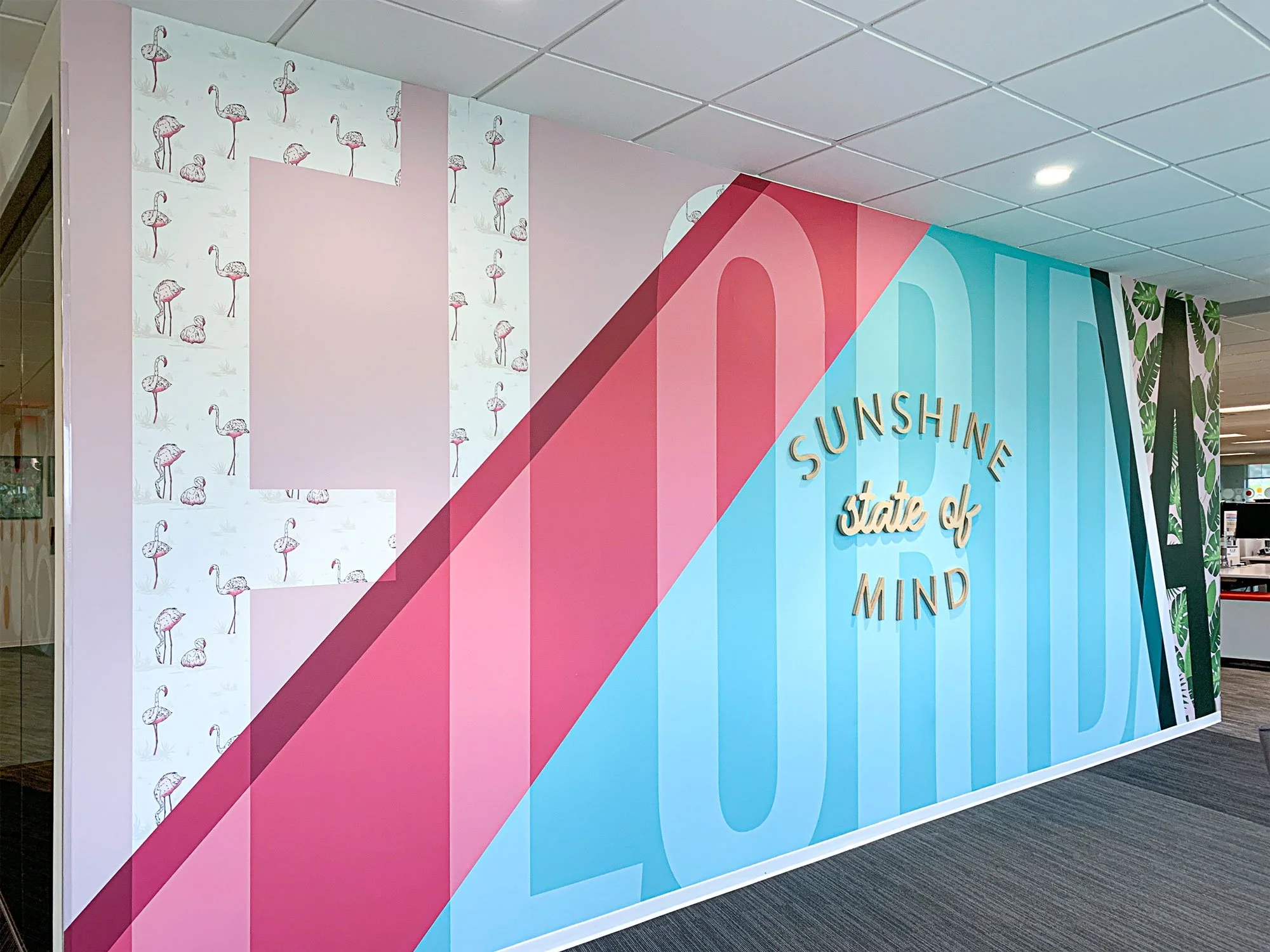
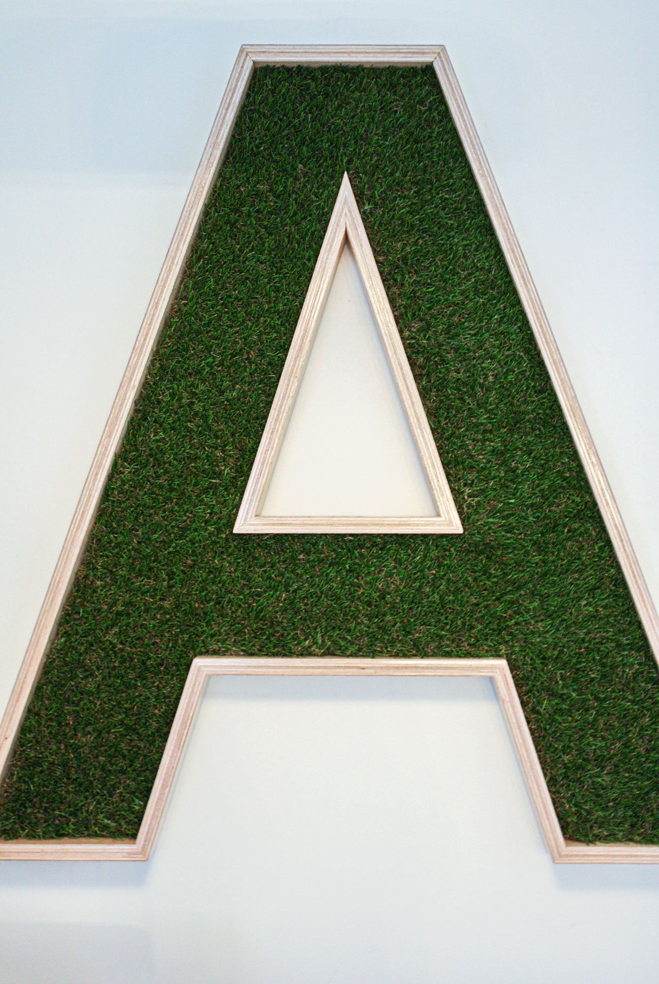
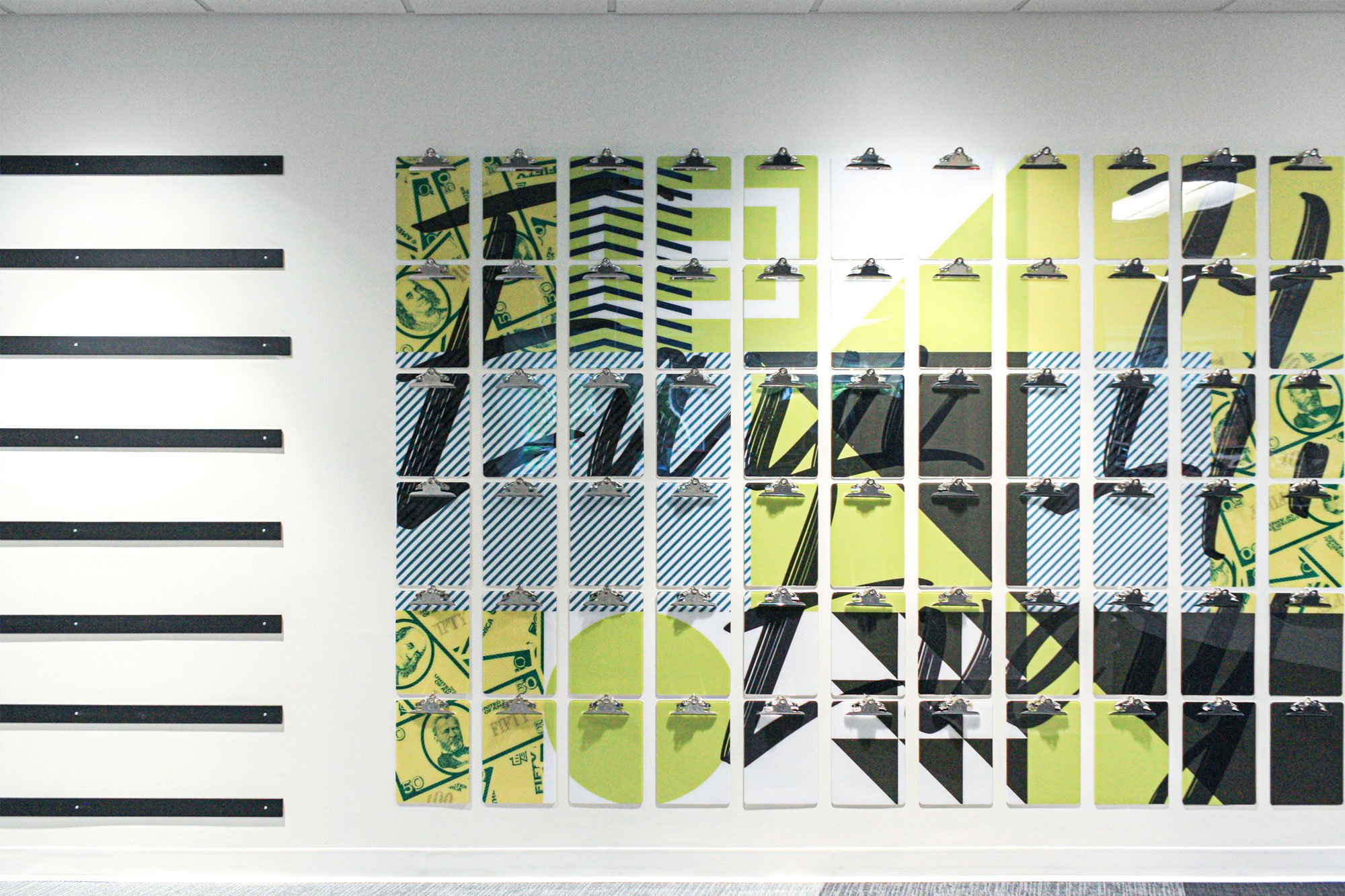
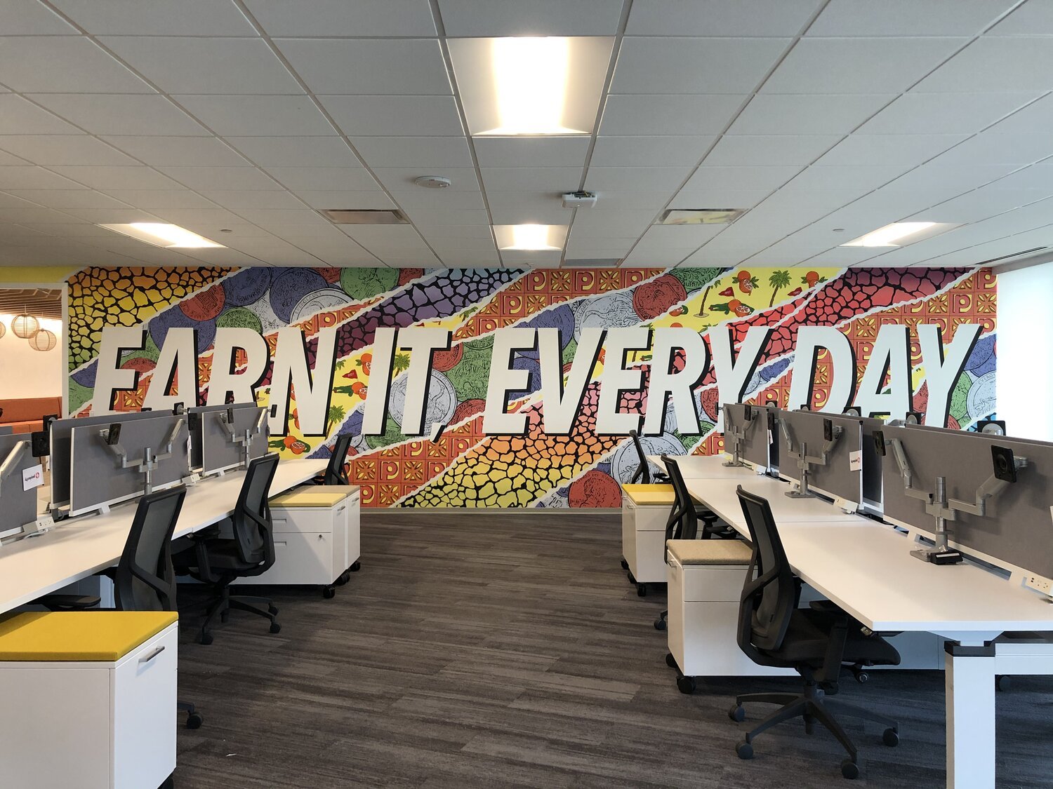
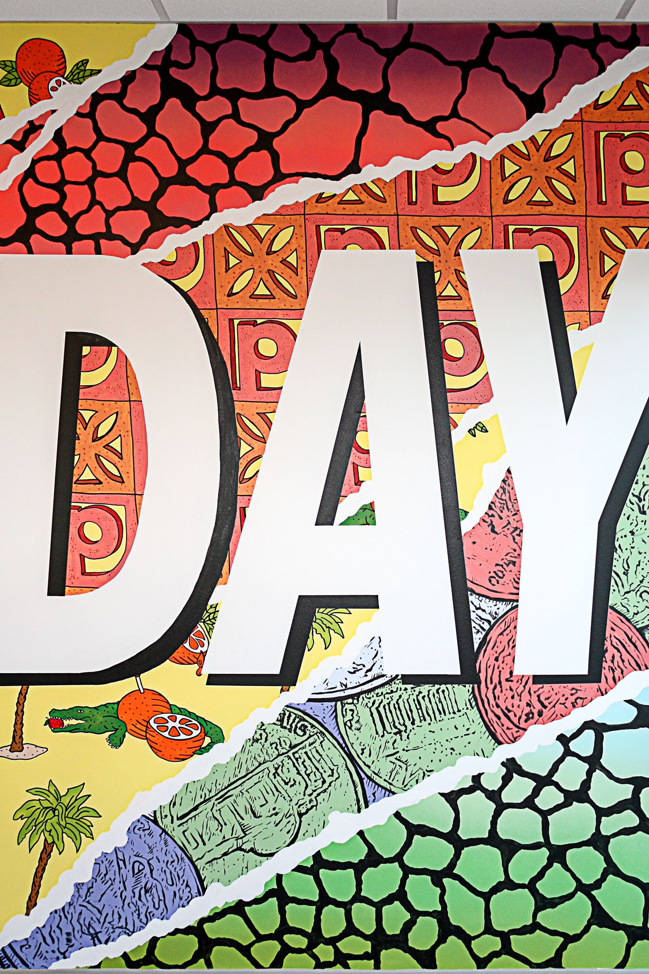
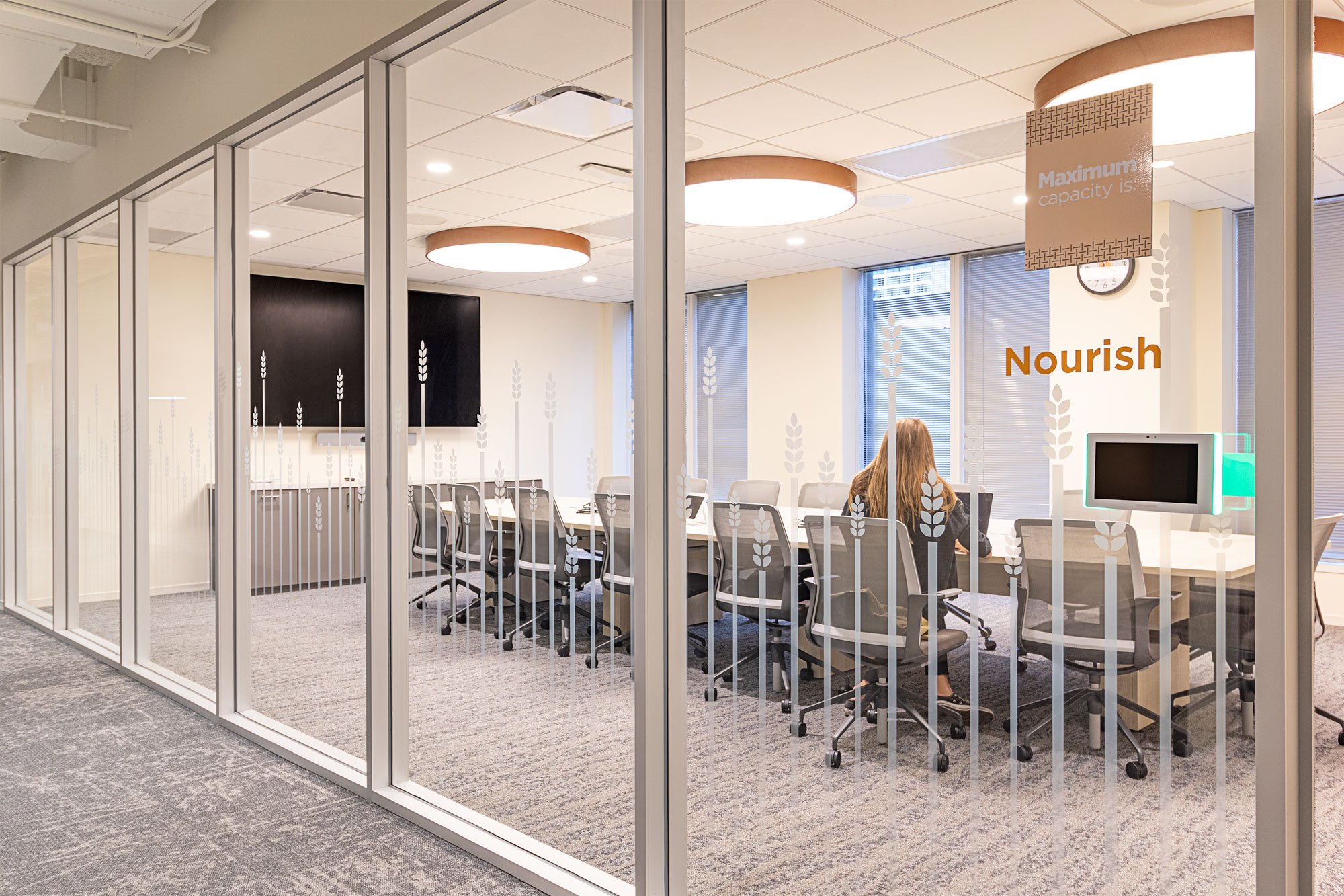
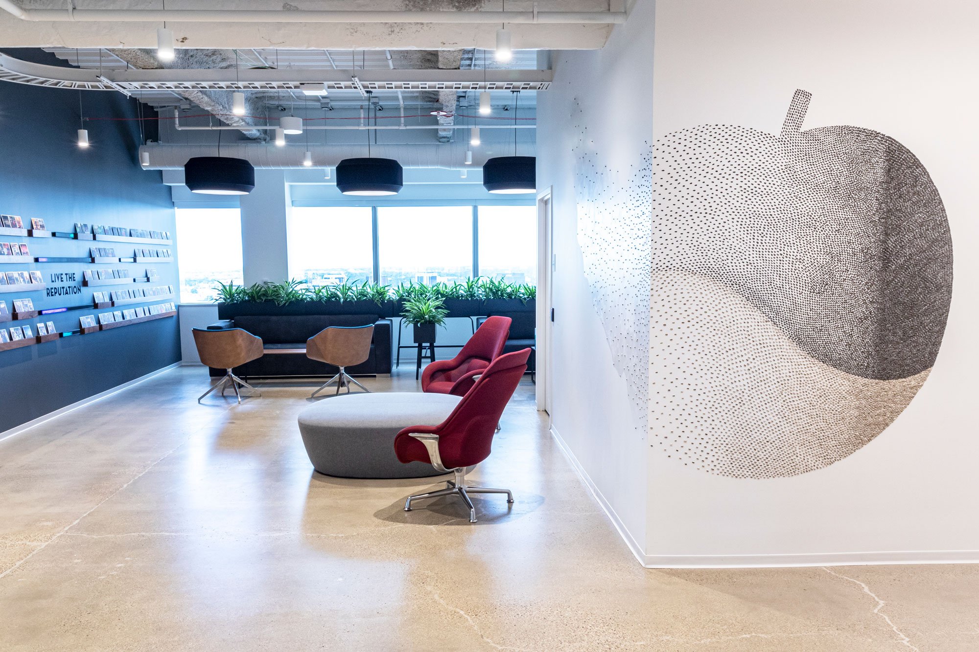
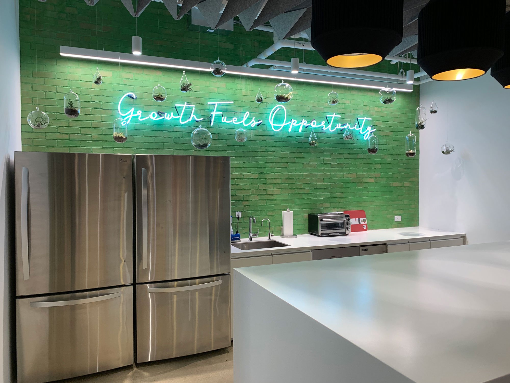
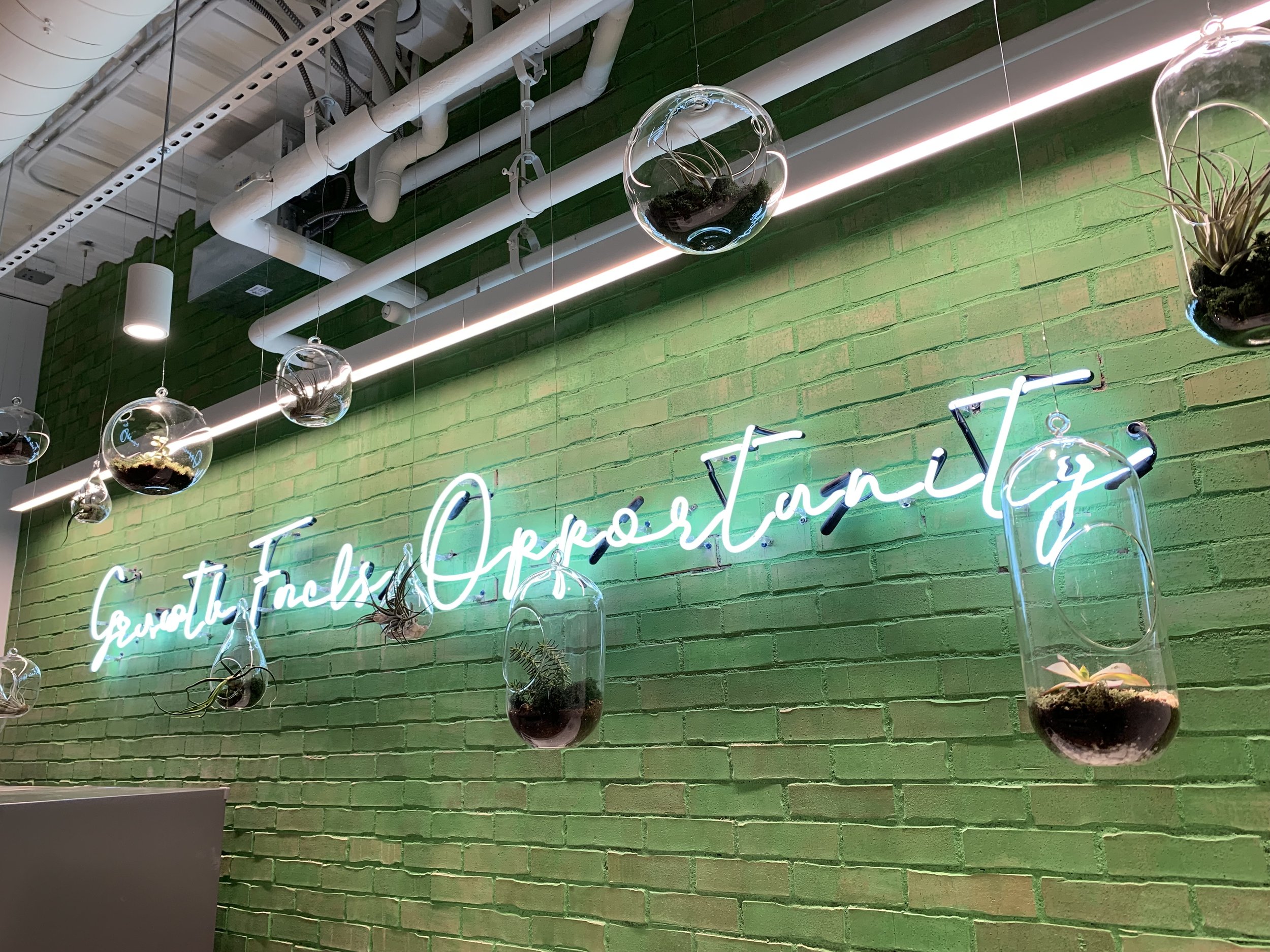
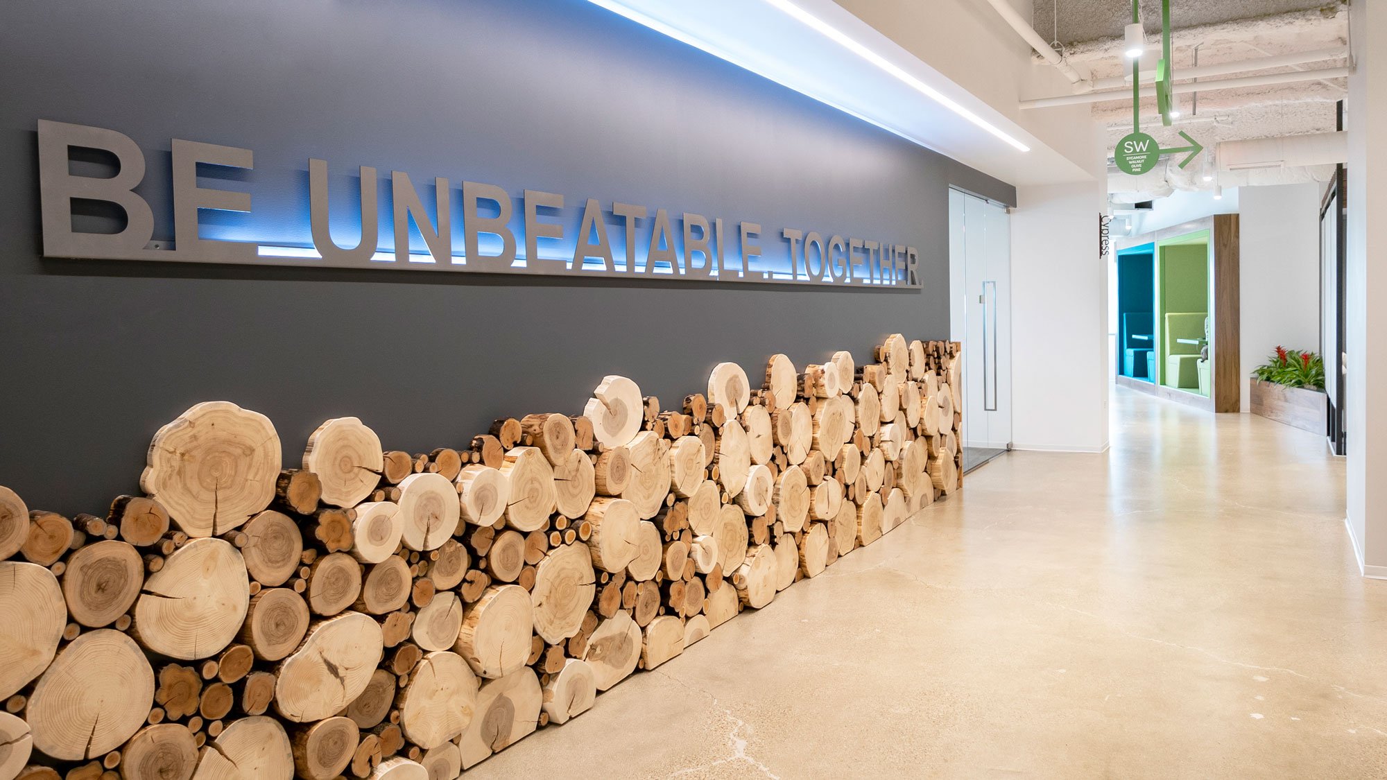
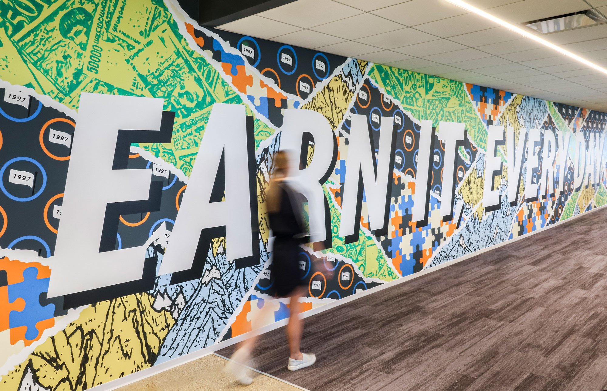
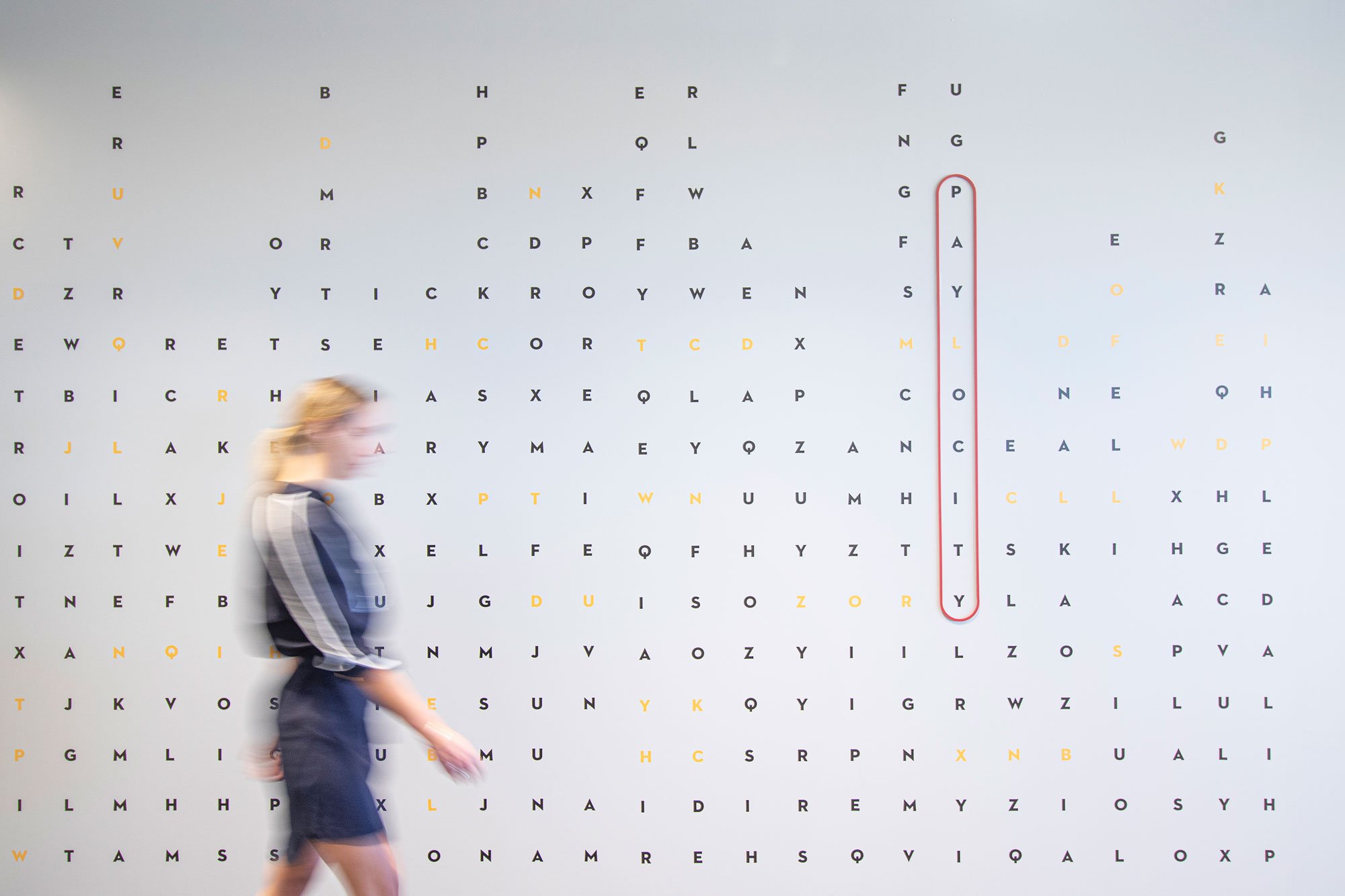
As the developer of industry-leading human capital management software, Paylocity needed a workspace to reflect its best-in-class dedication to service. Blending Paylocity’s culture with the local geographic flavor is always the key to branding their spaces.
One challenge with this client was taking their original logo (half an apple and half an orange) and making it a strong feature within the space. The client knew the logo wasn’t great, but it needed to tell their story. It was part of their brand. It was their mark. It will forever be part of where they came from.
The logo made it our solution to the design problem. Every floor and every office throughout the US would feature this logo and this logo would serve as the key to all the branded features. They varied per floor. These branded elements create a continuous narrative through the space that reinforce their brand and culture - no matter what location you go to.


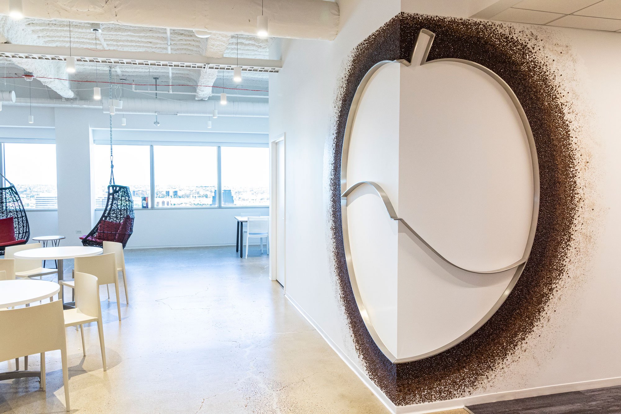


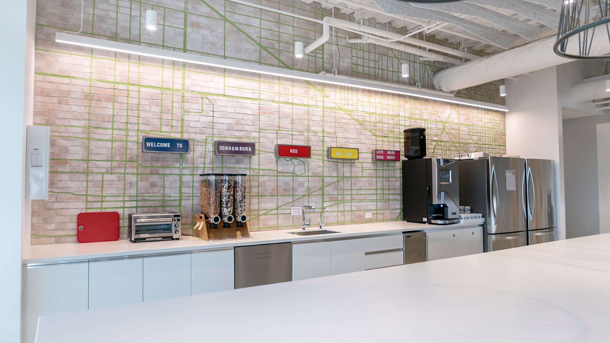

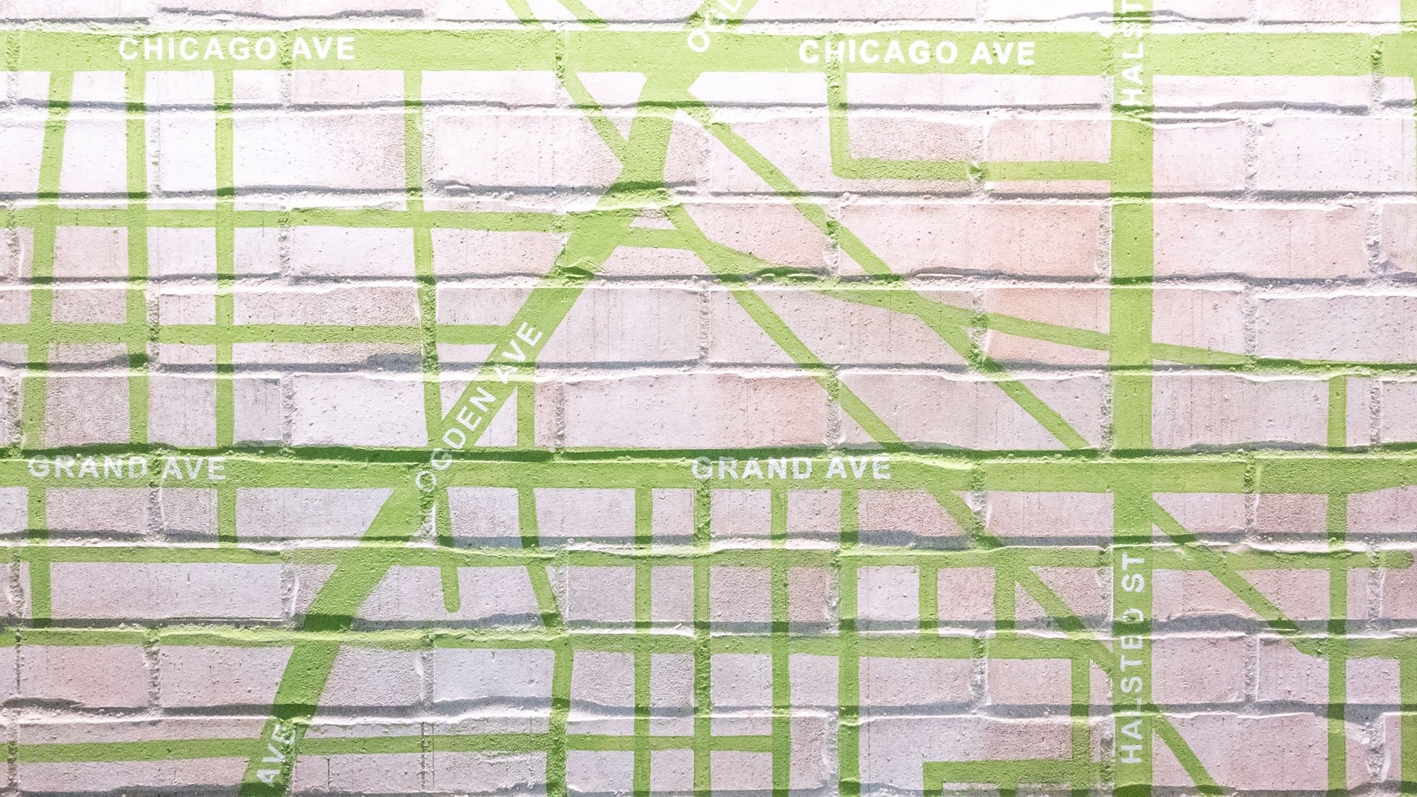


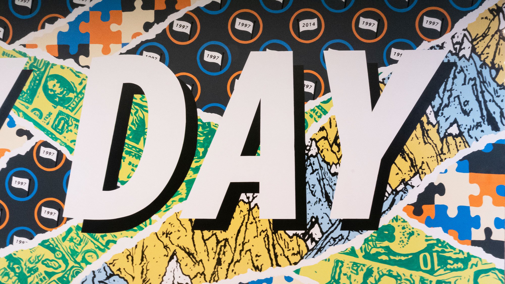

The Lake Mary location is a perfect example of how we use the logo formula to help us with the branding narrative.
This project features various graphics that relate to a theme that was developed for each floor. It ranges from Florida cities, to NASA’s presence, the various sport teams within the state, and last but not least, Florida as a destination.
There are various bold graphics, all completely custom, and interactive moments that allow their employees to engage within their space. Throughout, you will see numerous installations that required coordination and help from local artists.
This is Lake Mary’s story!